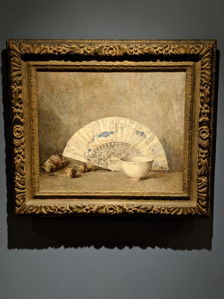
In comparison to yesterday’s still life by the same artist, the color palette is similar but different enough to warrant a mention, as it changes the diffusion of the light and the overall effect of the blurred dreaminess of the edges. Also the overall composition grouping is similar, but just different enough to tweak your senses and make you go, “hmm”. Of the two, I actually prefer this one because the background is simpler and less cluttered and hodge-podge Victoriana feeling.