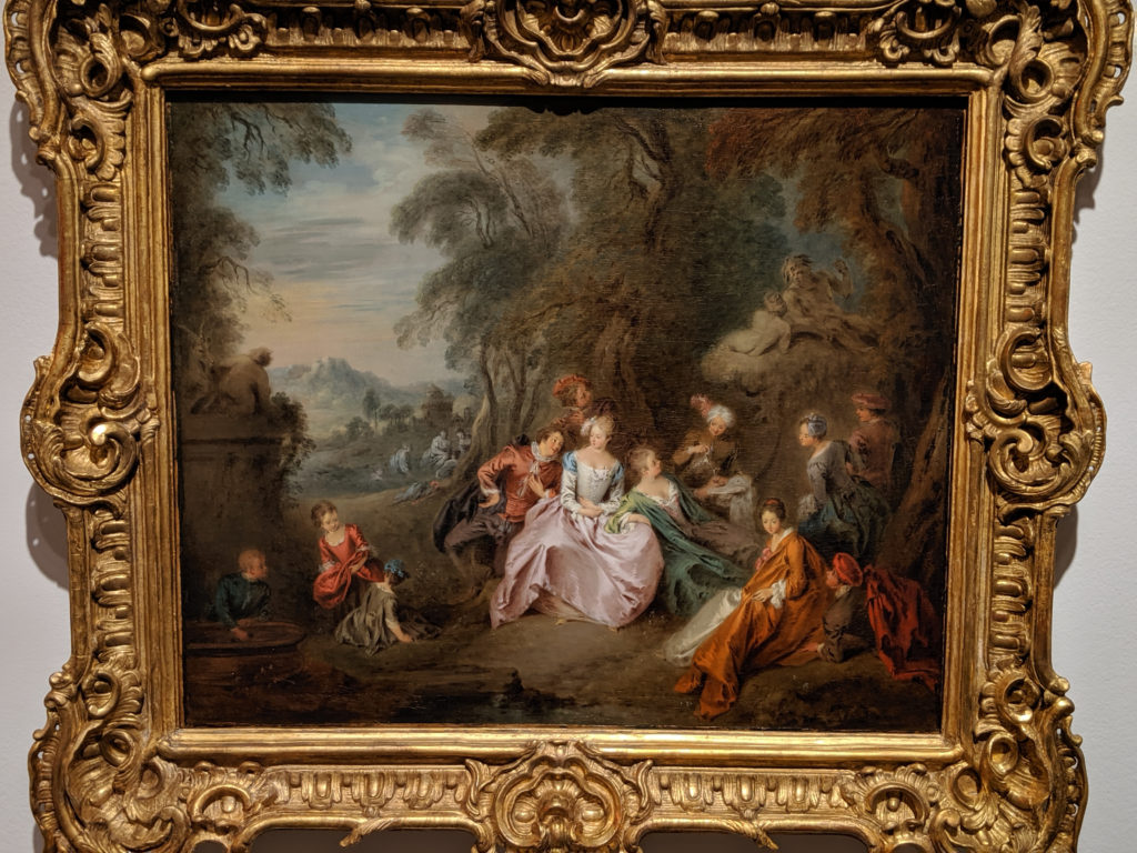
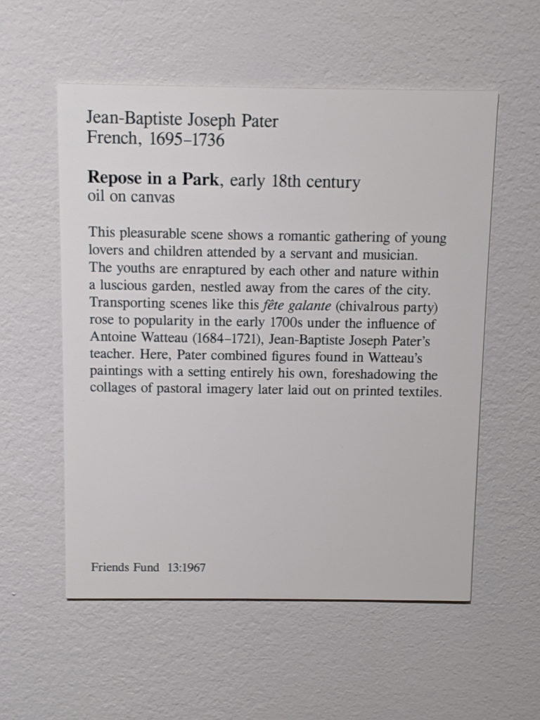
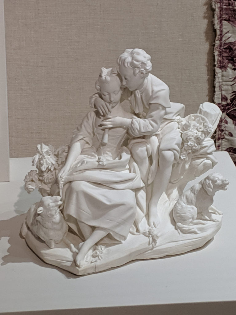
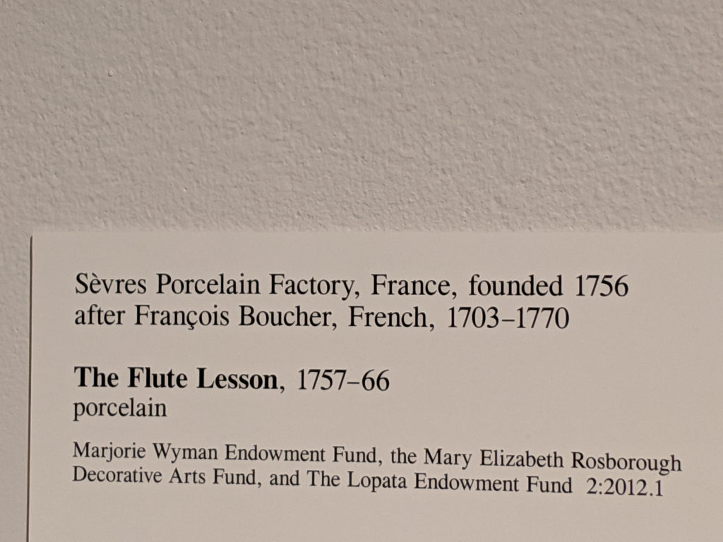
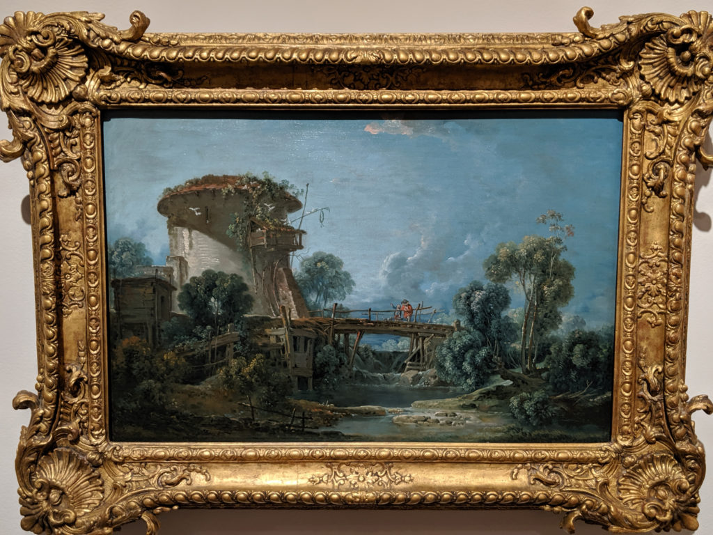
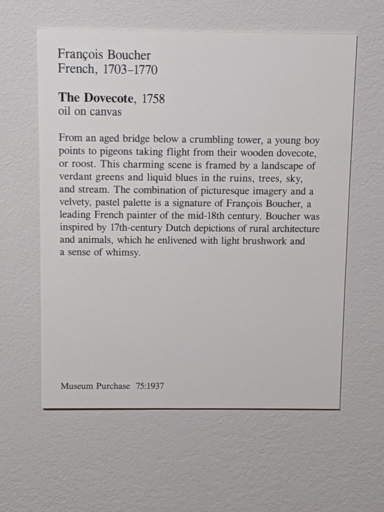
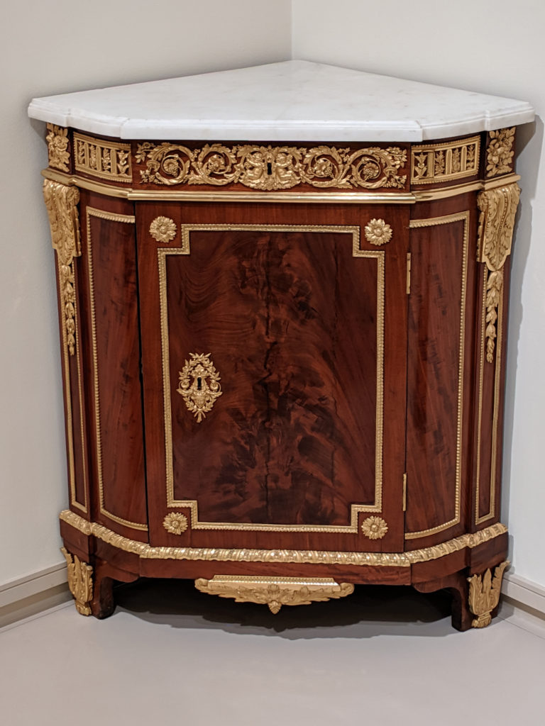
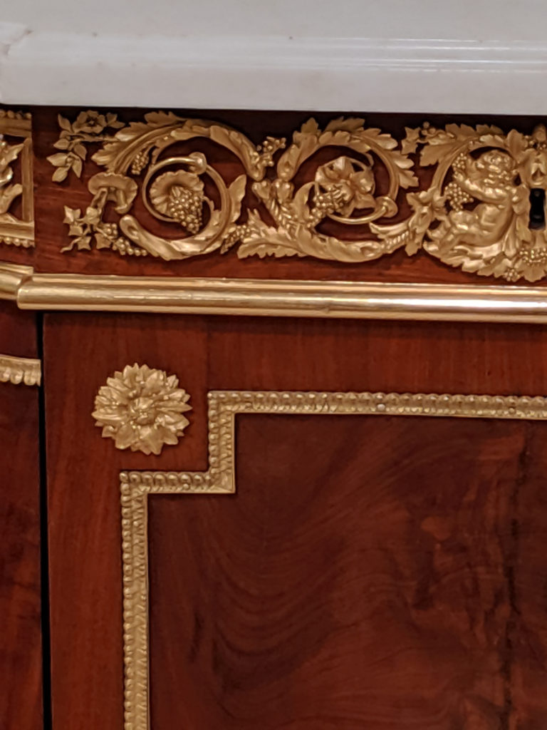
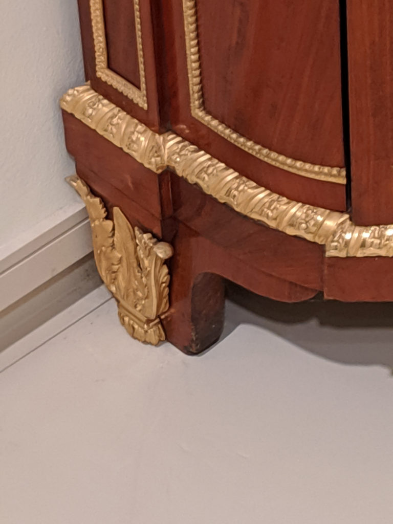
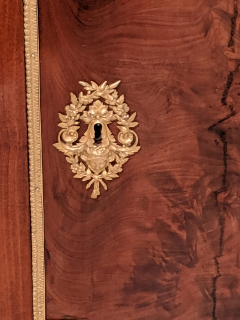
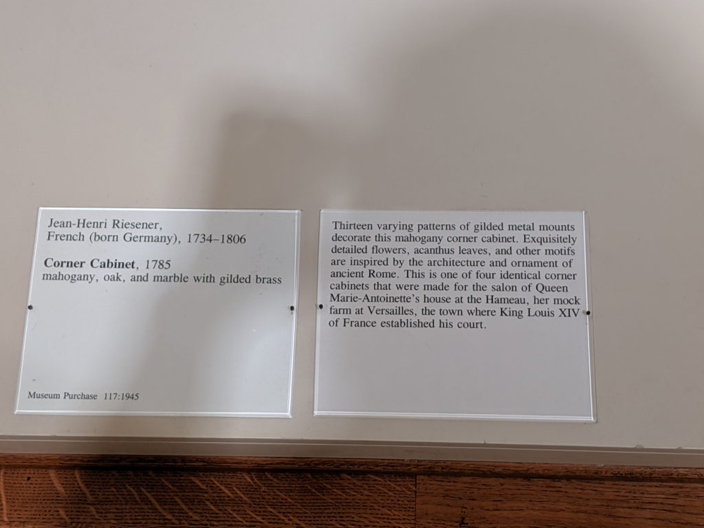
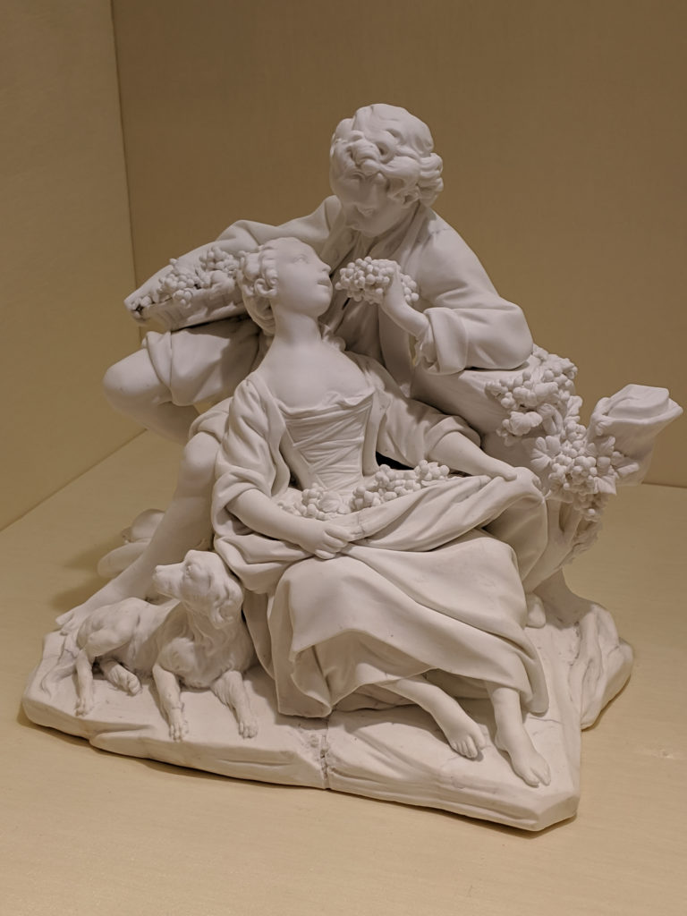
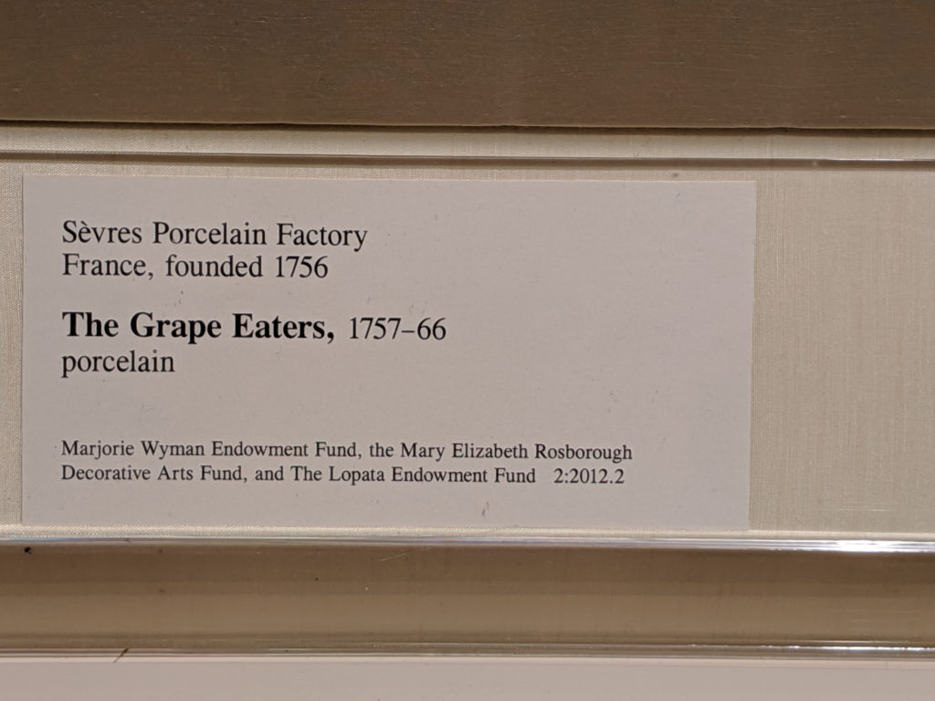
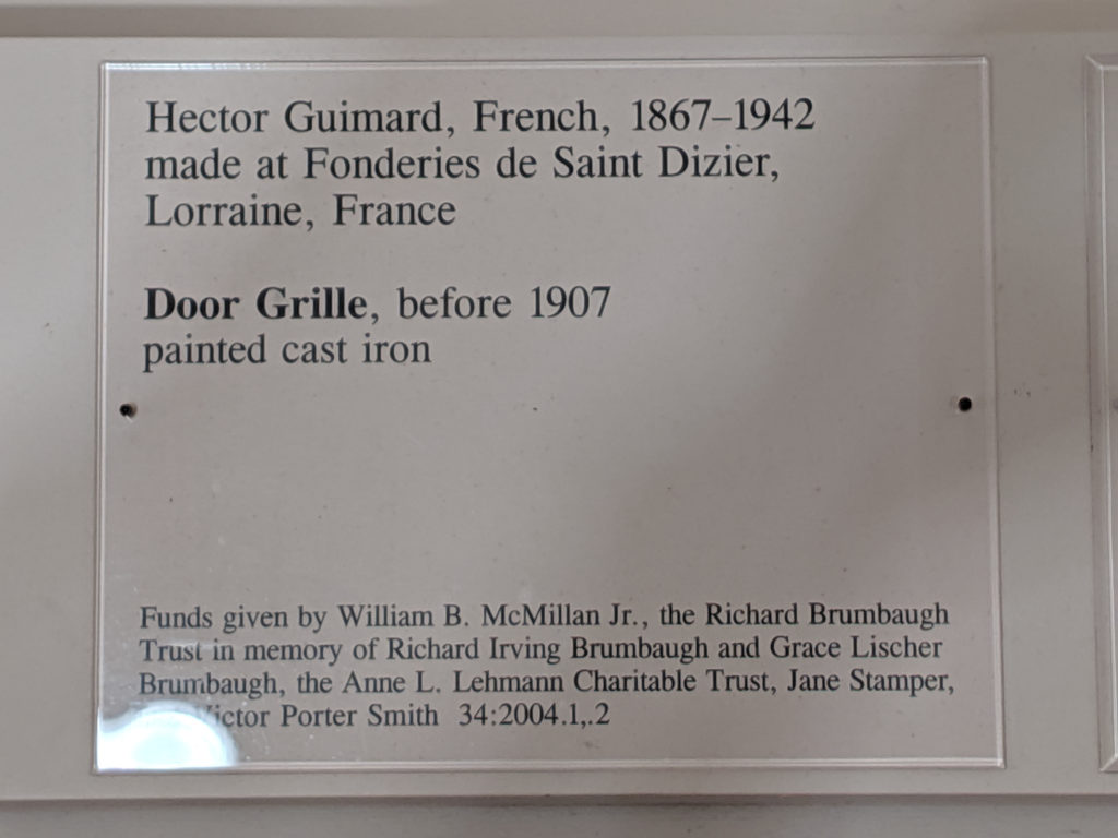
This, again, is another one of those bridges between Baroque and Rococo that doesn’t quite fit either genre but shares elements of both movements.
Month: September 2019
Thursday
Wednesday
Tuesday
Every time I go into the Museum, I comment on how so many of the things seem to have come out of the original countries in times of war or just after war. (Aka, many of the Islamic items are from 1919 – collapse of the Ottoman Empire, many of the French items are 1945, post-WWII, etc.) I feel sad that we’re the beneficiaries of, basically, the equivalent of looting a country of its treasures in order to maybe barely feed its people for a few days.
In this case, what a treasure it is. No exaggeration.
Monday
Sunday
Saturday
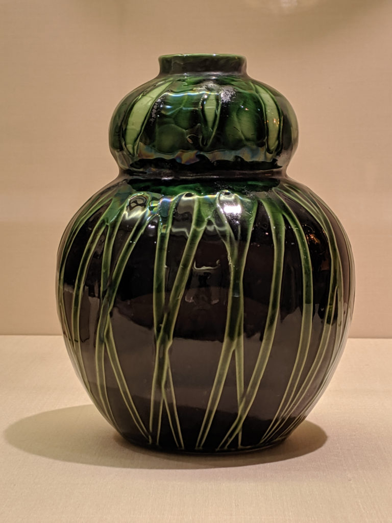
This particular piece of pottery looks like it’s being wrapped up in vines – and that impression is exactly what was meant to be communicated. The shape is very unsubtle in its execution of the ‘feminine ideal form’, coupled with the natural vibe and the Art Nouveau styling makes it very specific to the time period. It’s that not quite Victorian, not quite Edwardian.
Friday
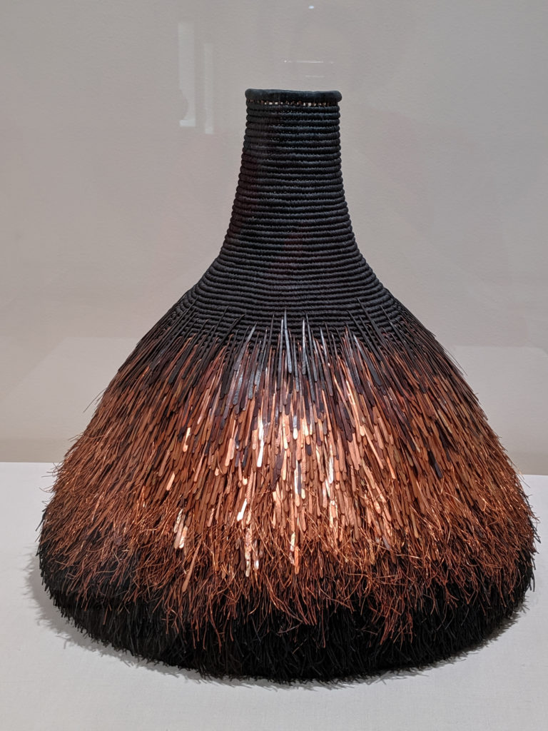
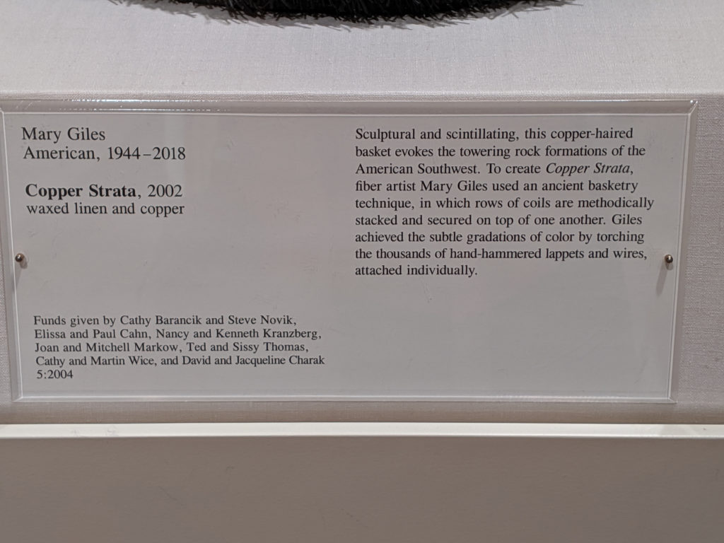
I must be a complete weirdo because this is reminiscent of a bird; the shape, the strata, the overall… it’s very birdlike. I enjoy the variegation of the color and the texture and mixed media weaving throughout the piece. It’s actually much larger in scale than it looks in the photo, and up close is much more fascinating. I adore everything about this.
Thursday
Wednesday
I fucking fangirl frakking puffy heart this glass sculpture like omg whoa. It looks like a block of lousy blue glass but it’s so much more than that. If you get all the way down by the right corner and peer up, you can see through the center open trapezoidal space of the piece (as I tried to do in the second photo and failed miserably because I couldn’t get the angle because of a damn wall in my way). It’s an amazing use of spatial compositional balance, and when the sun streams down in through the glass and catches the bubbles? Bellissimo!
