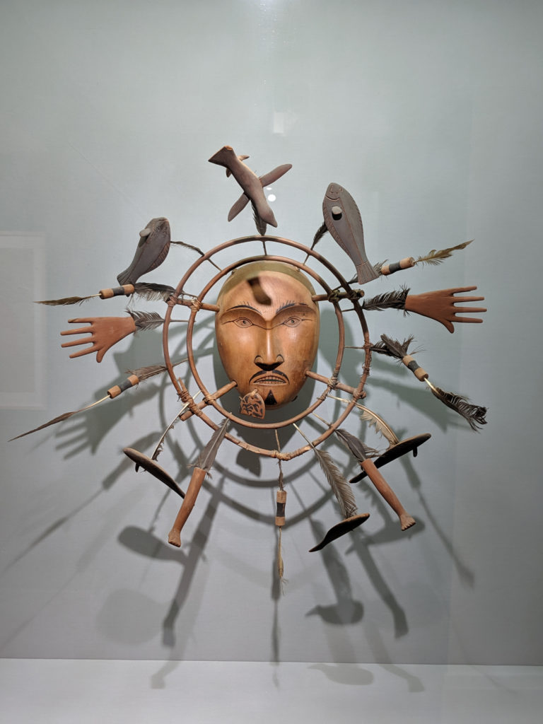
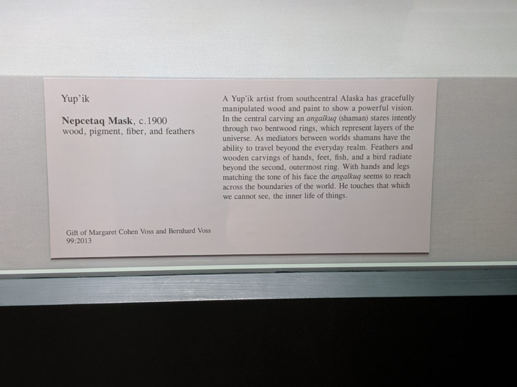
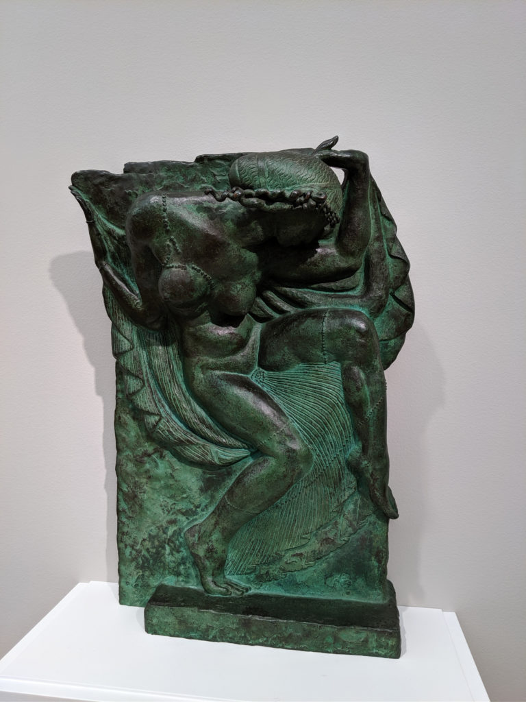
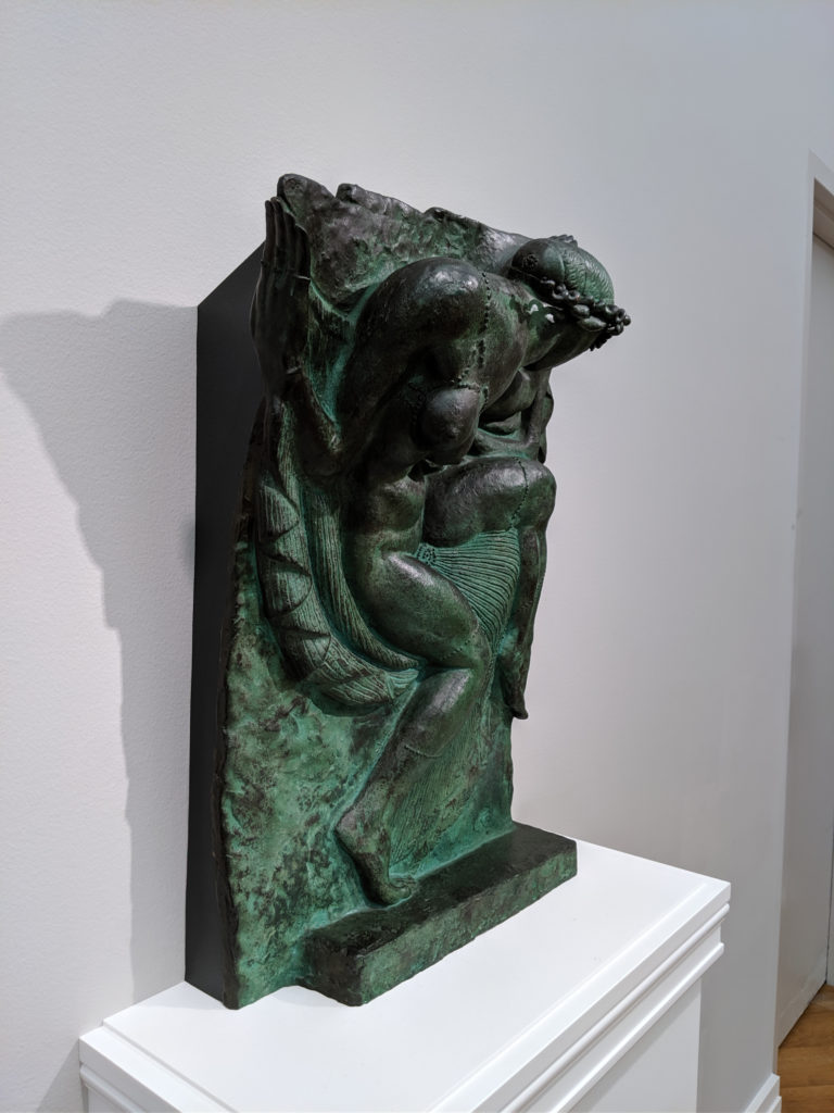
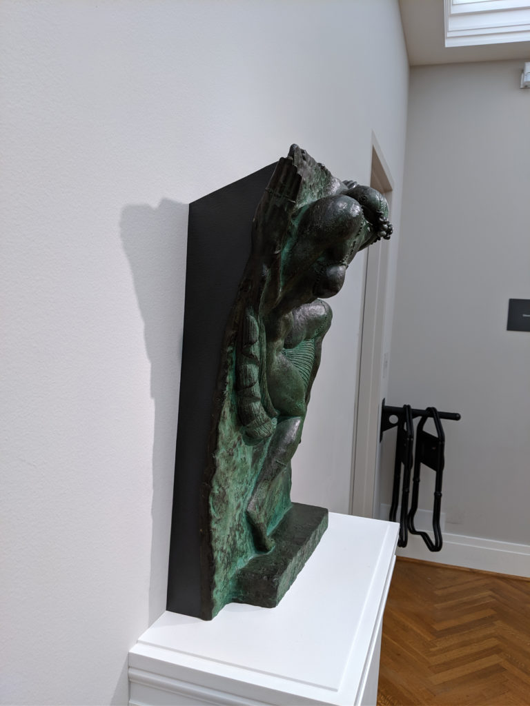
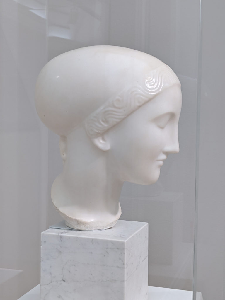
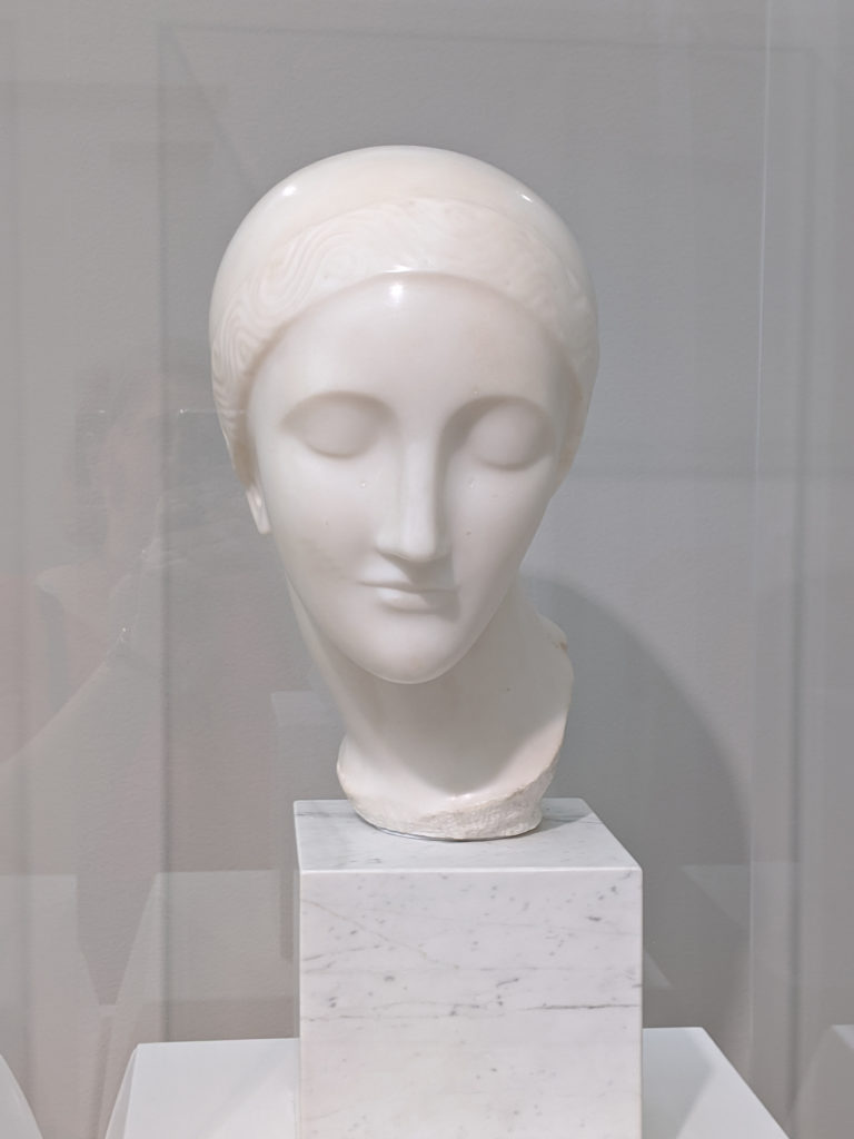
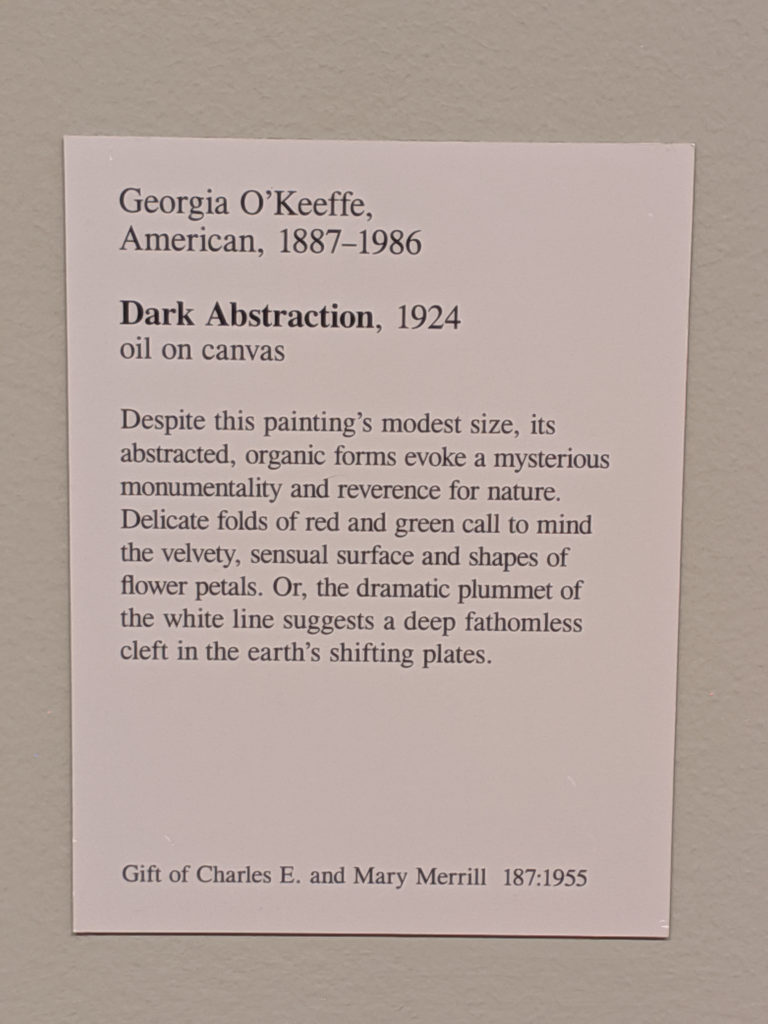
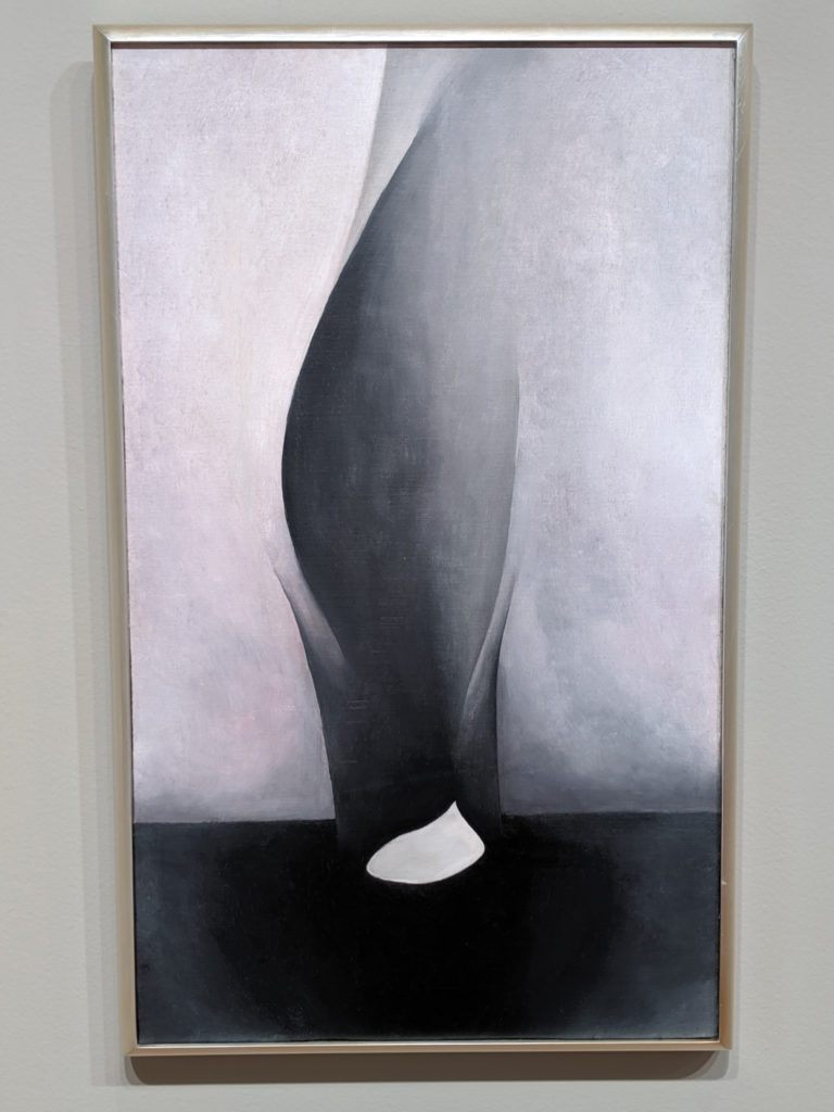
This thing is weird as all hell and looks like a sea anemone gone wrong. Fight me.
Month: September 2019
Monday
Sunday
Saturday
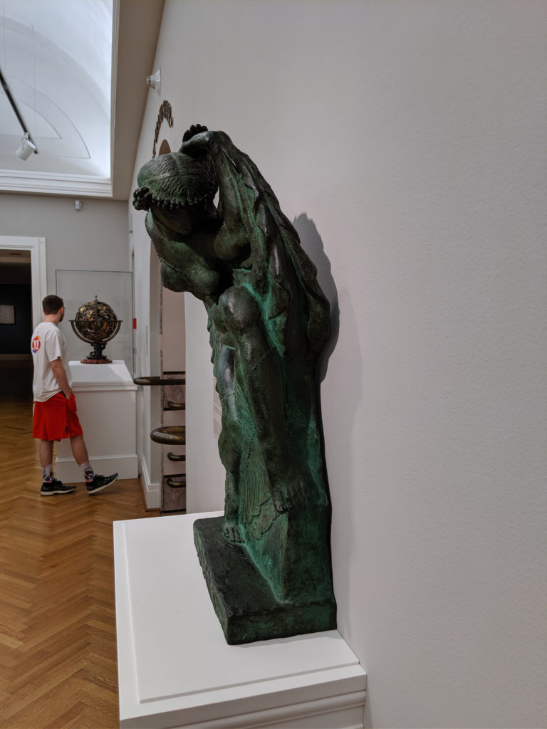
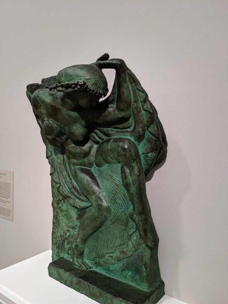
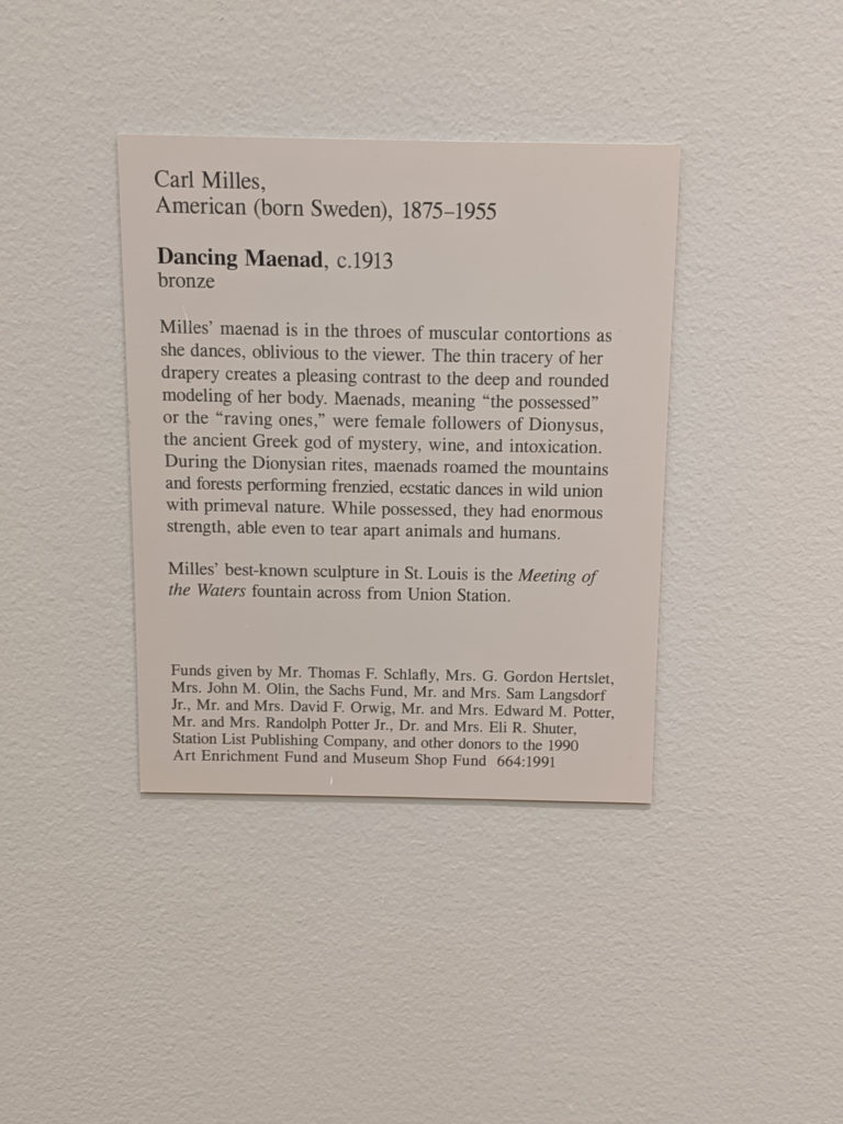
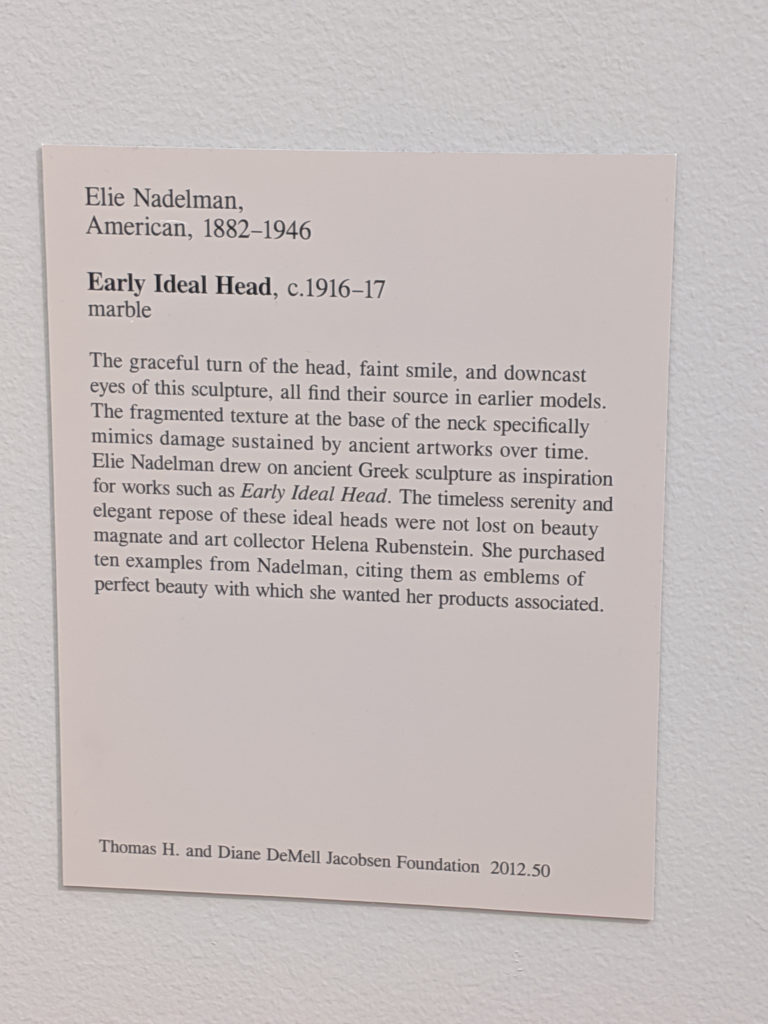
This is another one of those problematic American sculptures that smacks of institutional racism but at the same time is breathtakingly beautiful for what it is and the sheer bloody talent that went into the piece. It isn’t ideal, nor is it idealized except in the artist’s eyes, and it should be said as such. In fact, the features are over-exaggerated in a way that even the ancients would likely have cringed at and thrown away; instead, it is an approximation of an approximation and rather more like an idealized caricature of a female form than any idealization of a modernization. It even has a bit of the post-impressionism expressionism or slightly pre-Art Deco about it without really managing to be any of those things.
Friday
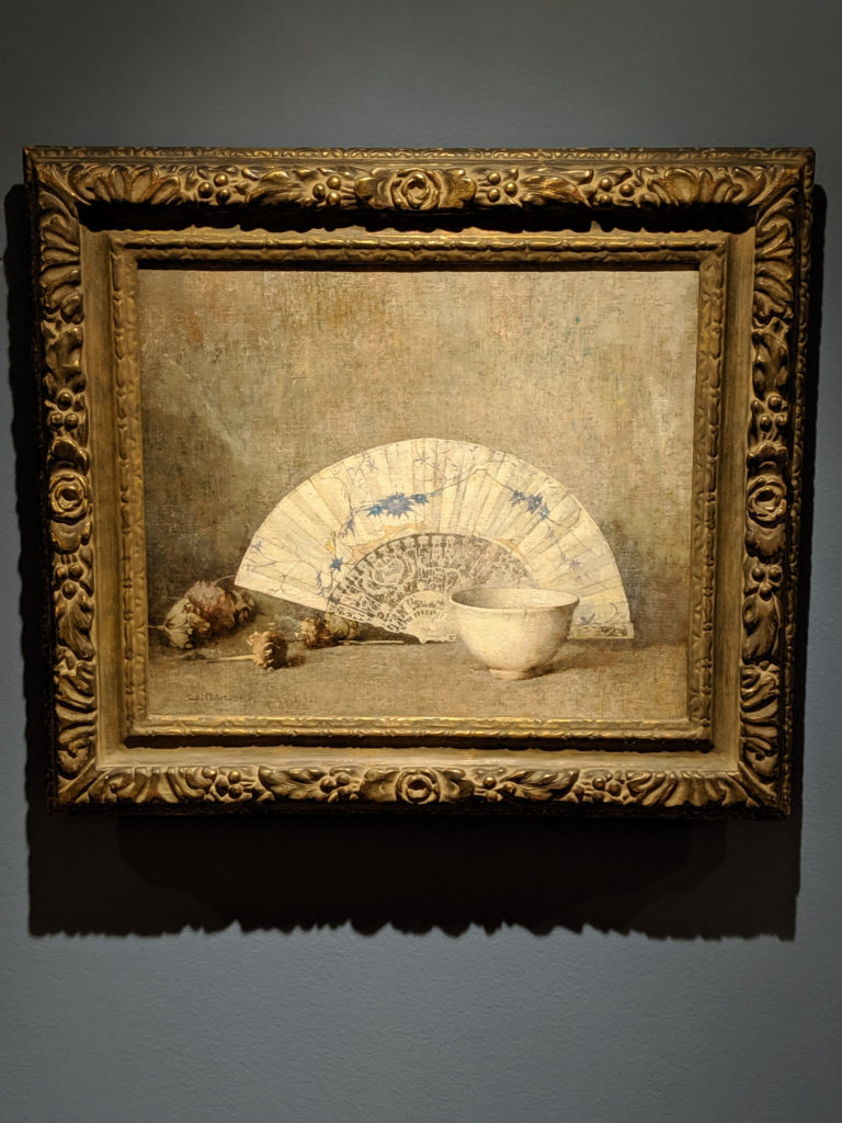
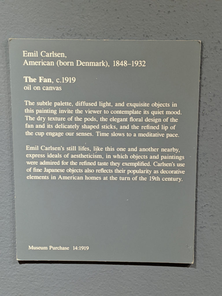
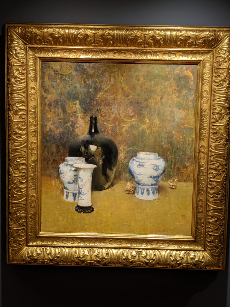
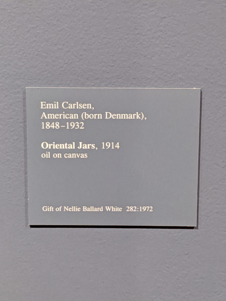
In comparison to yesterday’s still life by the same artist, the color palette is similar but different enough to warrant a mention, as it changes the diffusion of the light and the overall effect of the blurred dreaminess of the edges. Also the overall composition grouping is similar, but just different enough to tweak your senses and make you go, “hmm”. Of the two, I actually prefer this one because the background is simpler and less cluttered and hodge-podge Victoriana feeling.
Thursday
Wednesday
First off, the background is not grey. It’s kind of a watercolored effect of grey, blue and green that comes off as a muted greyish tone in most places. But it definitely isn’t just grey. And I will fight anyone that says it is.
Secondly, it doesn’t matter what the forms are meant to be. What matters is that they are meant to be both positive and negative within the space. They are meant to both work as sharpness and softness against the background, and that is why the background tone is watercolor muted and mixed as it is – to give the distinct definition that the angles and fluid lines need in order to work as they need. And I will fight you if you say otherwise.
Tuesday
Monday
Sunday
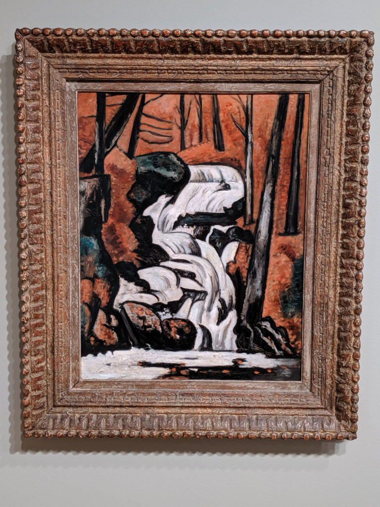
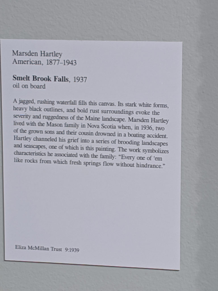
In many ways, this painting screams grief and despair. It is all angles and desolation and emotional distance, stark contrast of colors and furious slashes of highlights that don’t quite fit where they’re meant to. It’s wrong and painful and yet… you can tell it’s meant to be therapy. It is a benediction, a begging for life to feel normal again, a tiny glimmer of hope in the darkness of deepest depression.


