Brown is not my favorite color. Brown is not a color: it is all the colors mixed together, and as such, is a non-color. This painting is non-color to the nth degree. However, I still enjoy it for the x factor that it has – the bit of blurry watery-edged give no damn attitude and the way that it just shrugs and says, “take it as it is or not at all”. We all need that.
Category: European Art
Thursday
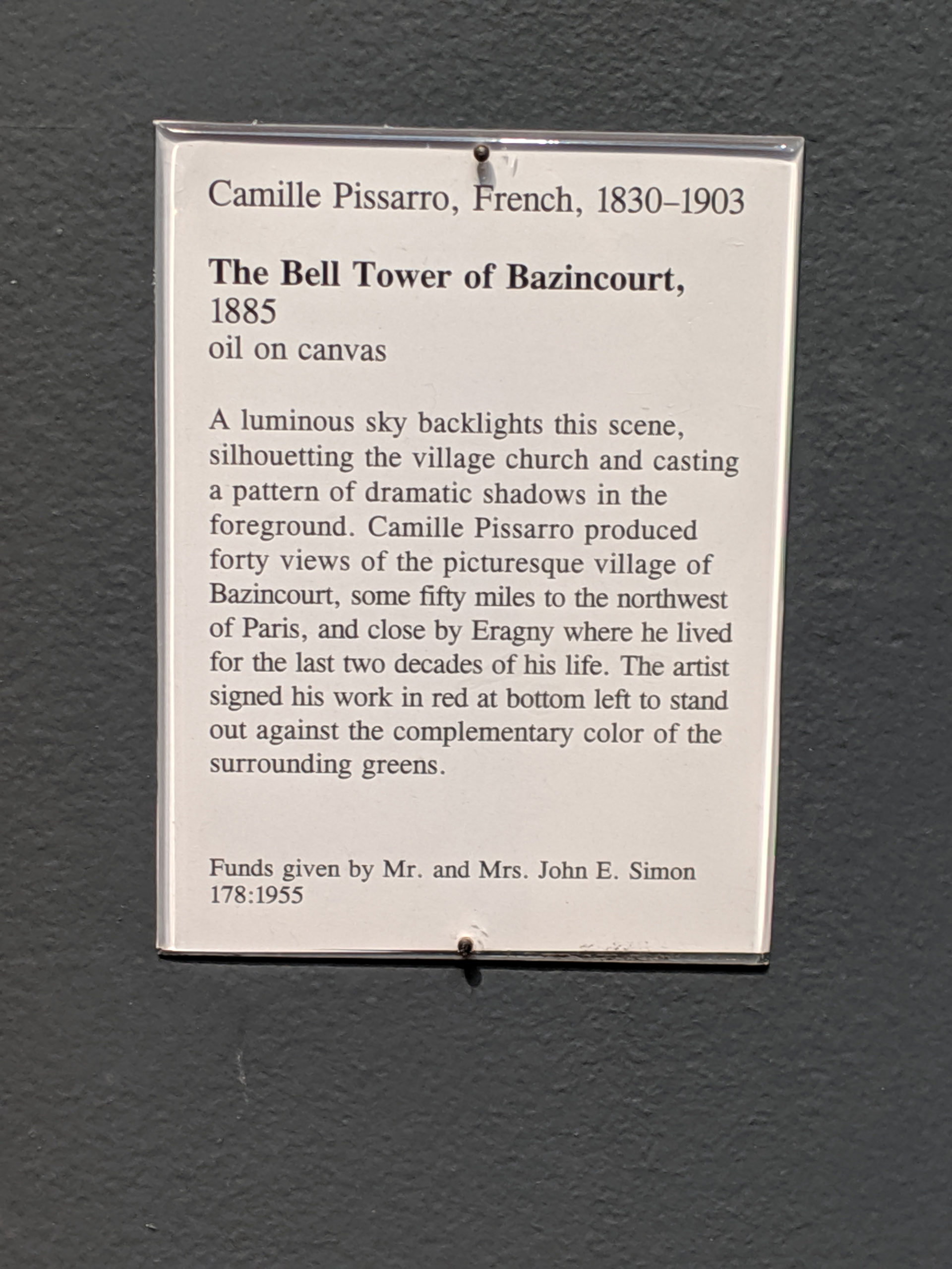
What I love about Pissarro is that his work is kind of the best of both worlds medium between Monet and van Gogh: it’s got the the dreamy ethereal quality of Monet with the bold color grasping of van Gogh, but somewhere in the middle is a seductive reasoning that only Pissarro managed to maintain.
Wednesday
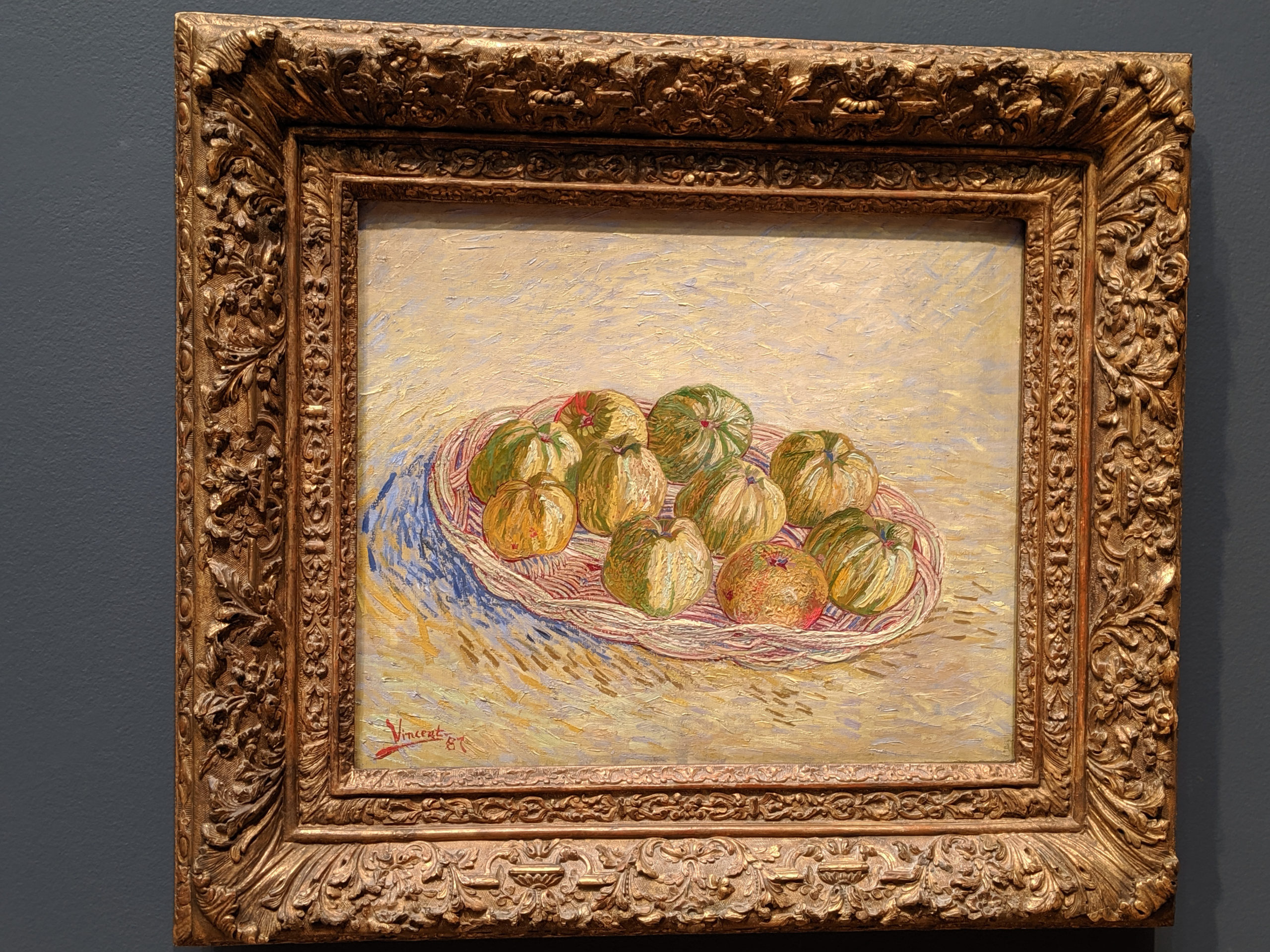
What better way to start the new year off than with another under-respected van Gogh masterpiece? While the colors don’t immediately leap off the canvas and grab you by the wrist and scream, “PLAY WITH ME” like many of his other paintings do, the effect of the palette of colors in this painting overall gives us another feeling: peace and serenity.
Tuesday
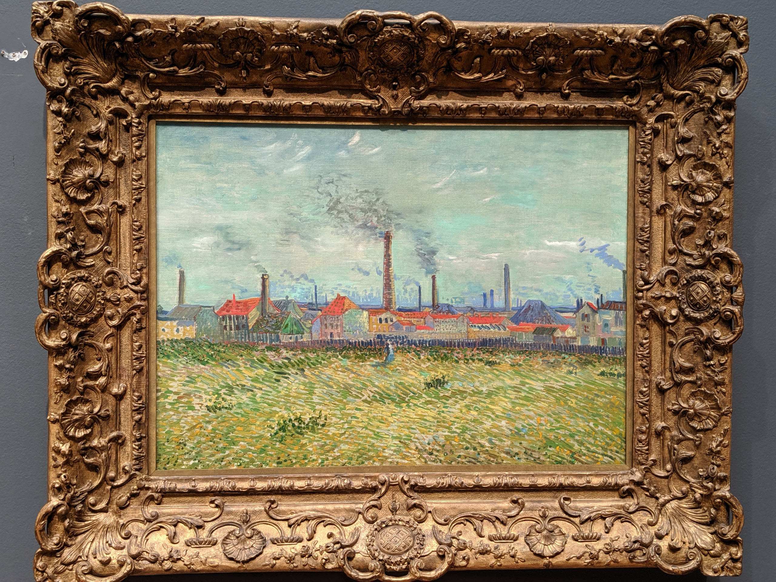
When people think of van Gogh, they so immediately identify with Starry Night or Sunflowers, and they don’t know about the wealth of so-called lesser works that dot the globe. I wouldn’t call this a lesser work, so much as an experiment in composition: it’s very clearly done in a tri-band, which was done to delineate the subjects clearly. The sky is separated from the factory from the ground, and each gets its own focus and its own color scheme and treatment. It’s like having three paintings in one, in a way: he’s attempting to channel earlier landscape artists by using the three color system to foil us into believing a sense of scale and continuity, but instead, he’s given us three separate entities to study. The sky with its hues of grey, green, green, and blue bleeding together almost as if in a watercolor technique. The factory line, in a perfunctory pastel oil sketch riot of colors and lines that scream impressionism. And the grasses of rich greens, yellows, and golds with flecks of blue that reek of pointilism and grasping at the newest ideas. This painting is an experiment and it is successful.
Monday
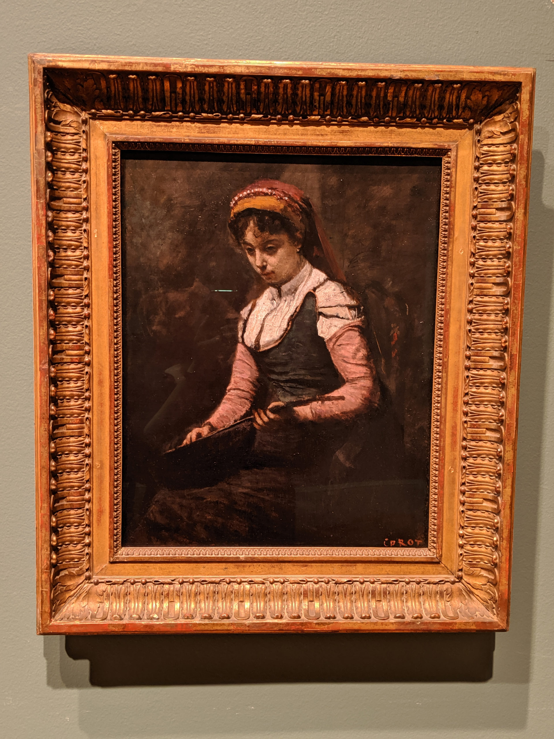
There is a weird juxtapositioning of time in this work: the model’s clothing doesn’t really fit the 19th century, but seems to harken back to an earlier romanticised version of the Renaissance or early Baroque, but even then, it’s none of those at all. What the hell, dude? Crazy confusing shit. You haven’t got an actual clue what you’re meant to be looking at because you’re too busy being confused by the wibbly wobbly timey wimey disturbance that is this chick’s clothes.
Sunday
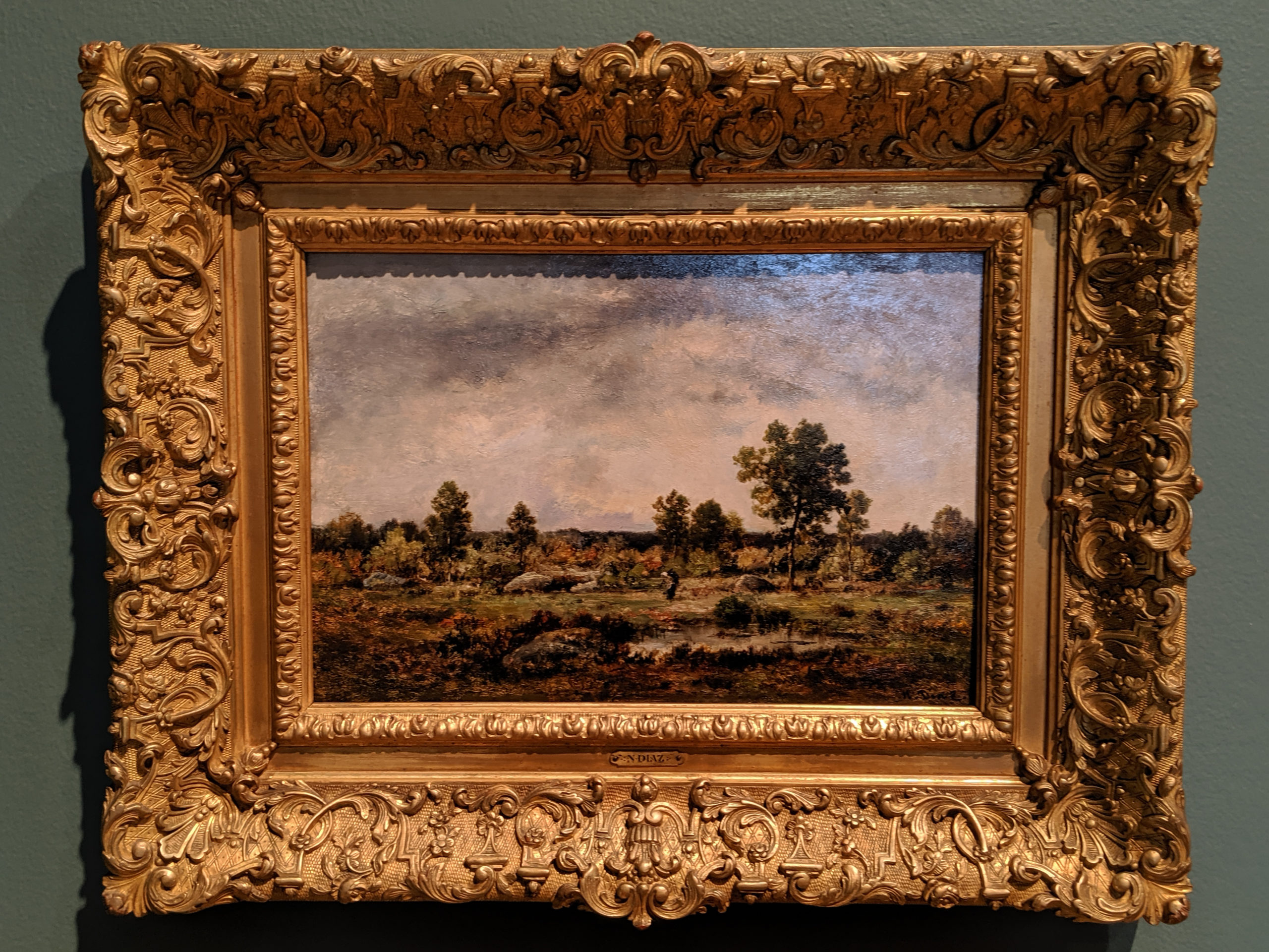
This is meant to be a direct attack on those people who claimed that the art of landscape painting was played out. If you notice, the detailing of the leaves and thickets is far more than needed to prove the point of what they are. Every bit of this painting is overkill.
Saturday
28 December
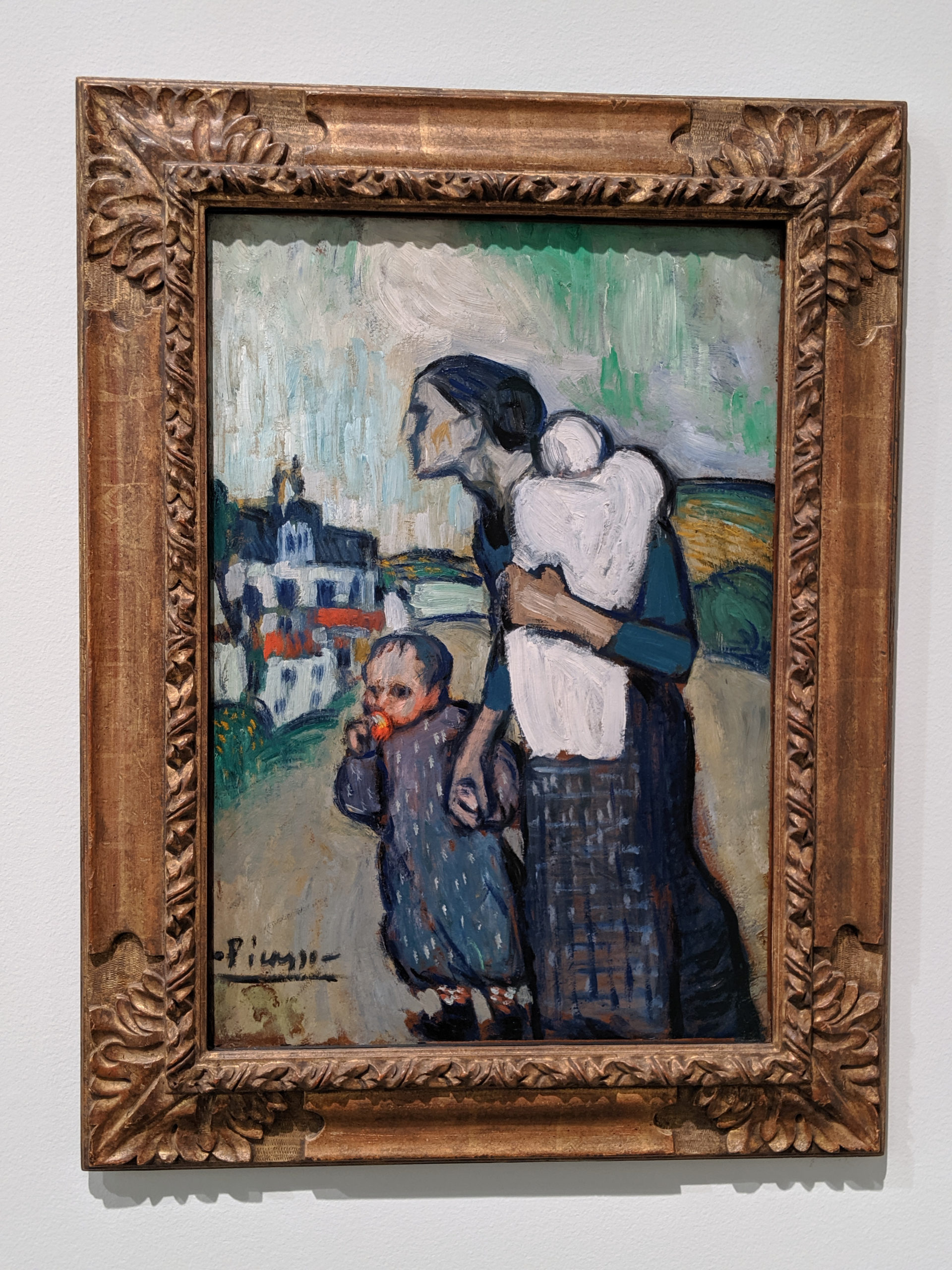
I’m not the biggest fan of Picasso, but in his early years, specifically the blue period, before he went off into the Cubist kind of “whoa okay” movement, I don’t mind him. This particular work is very moving, and up close, the use of complimentary oranges is very striking – it gives a layered nuance to the heavy usage of blues.
Friday
27 December
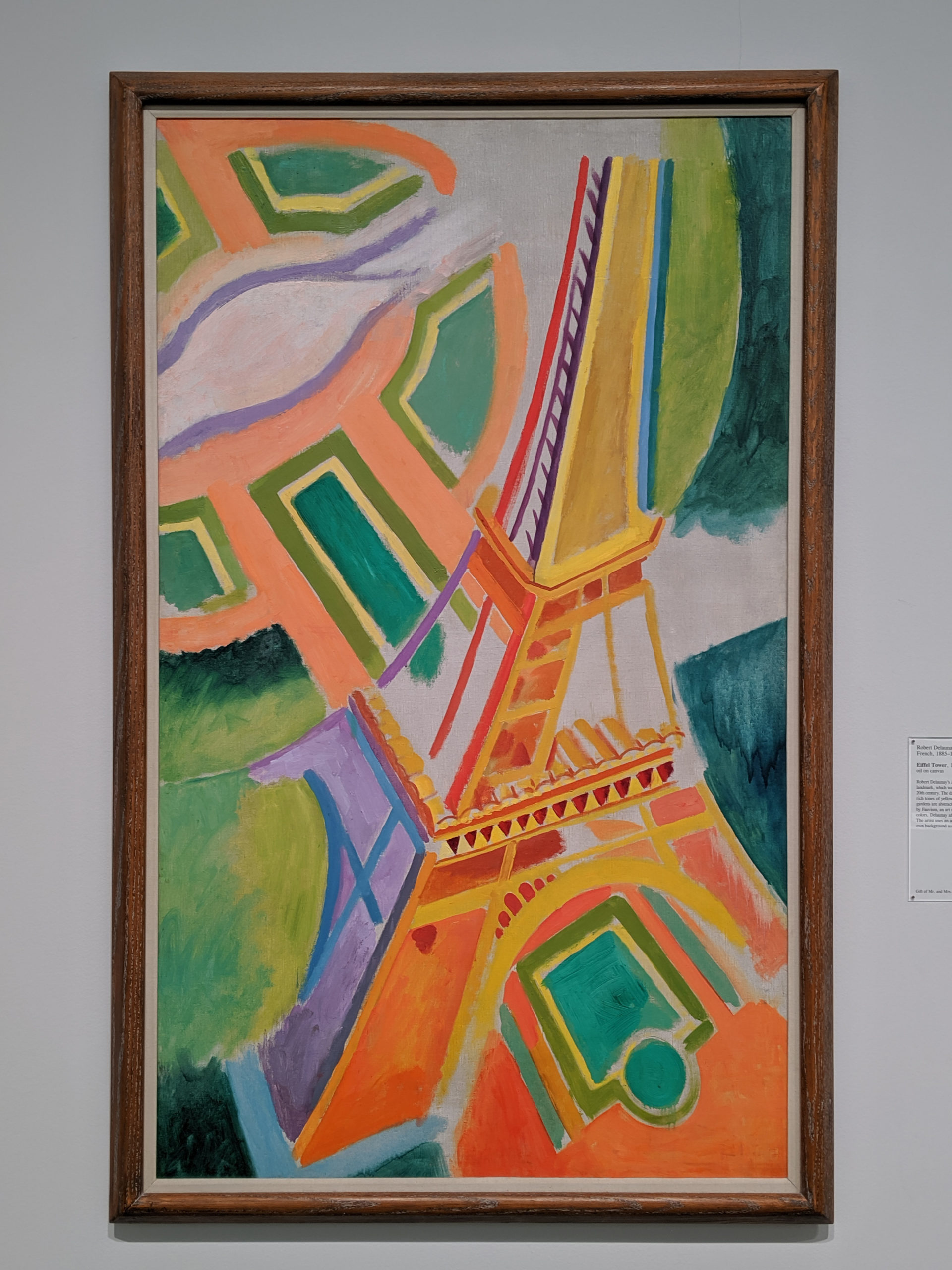
This is my favorite iconic view of the Eiffel Tower; it’s a pop art style in bright, perfect colors that stands out, but it was done in such a wonderful 20s expressionist style.
Thursday
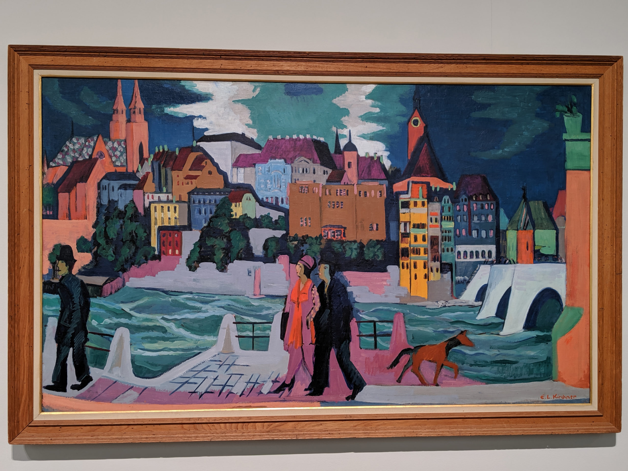
26 December
As opposed to The Tavern, this painting is meant to be appreciated for its open spaces, its colors, and its light. However, it is still meant to be uncomfortable in a different way – it is meant to highlight the darkness of the upper class and the plight of the invisible poor.
Wednesday
25 December
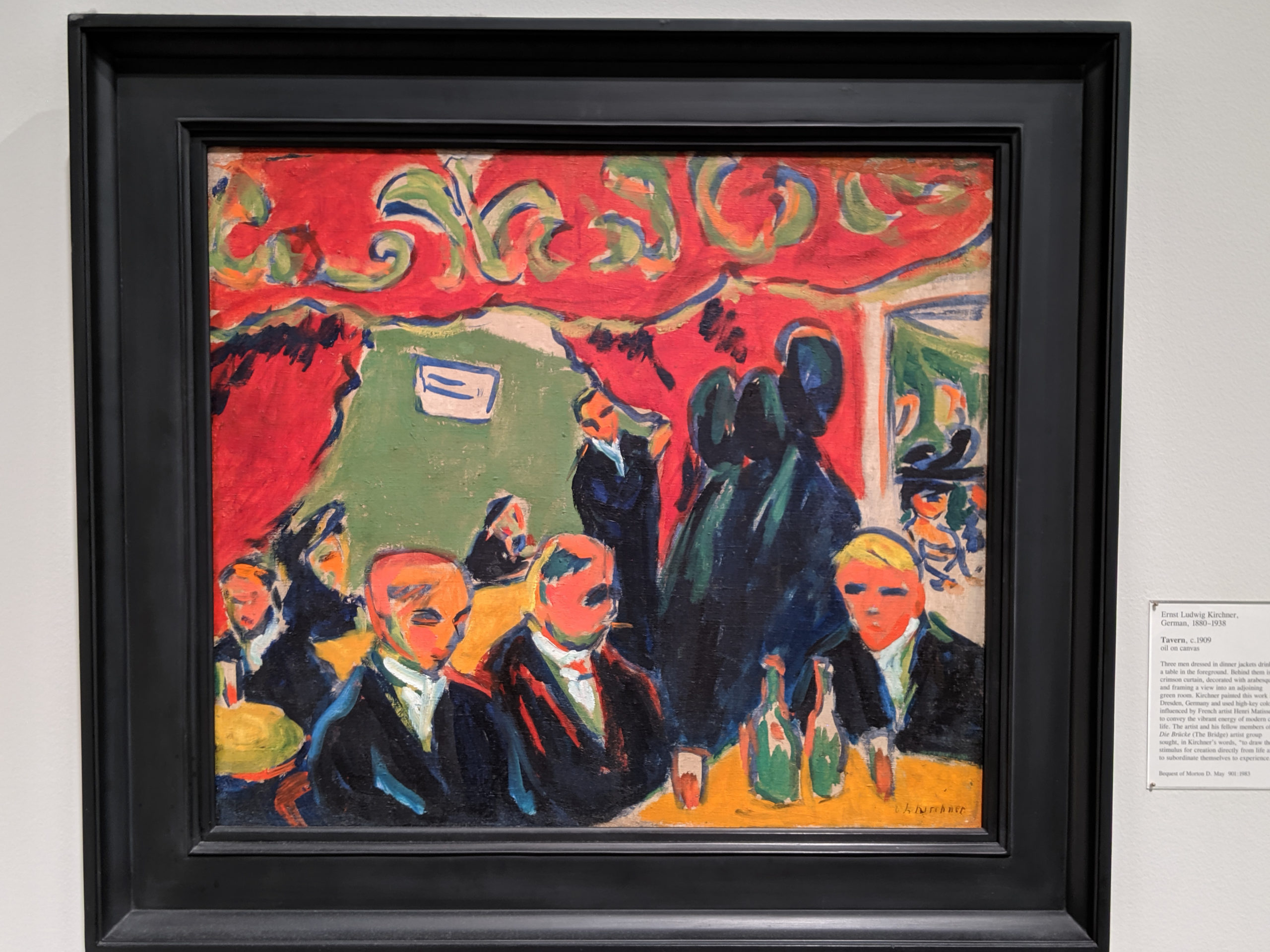
There is something about this that is just impermanent and fleeting, dark and destructive, visceral and cruel, even though it is none of those things and is just vague lines on a canvas. It might be the coloring, all primary and aggressive in a relentless way, or it might be the positioning of the figures, in a claustrophobic way, with no space between them and no feeling of dimension. But it is not a comfortable painting in any way, and it is not meant to invoke a feeling of such.