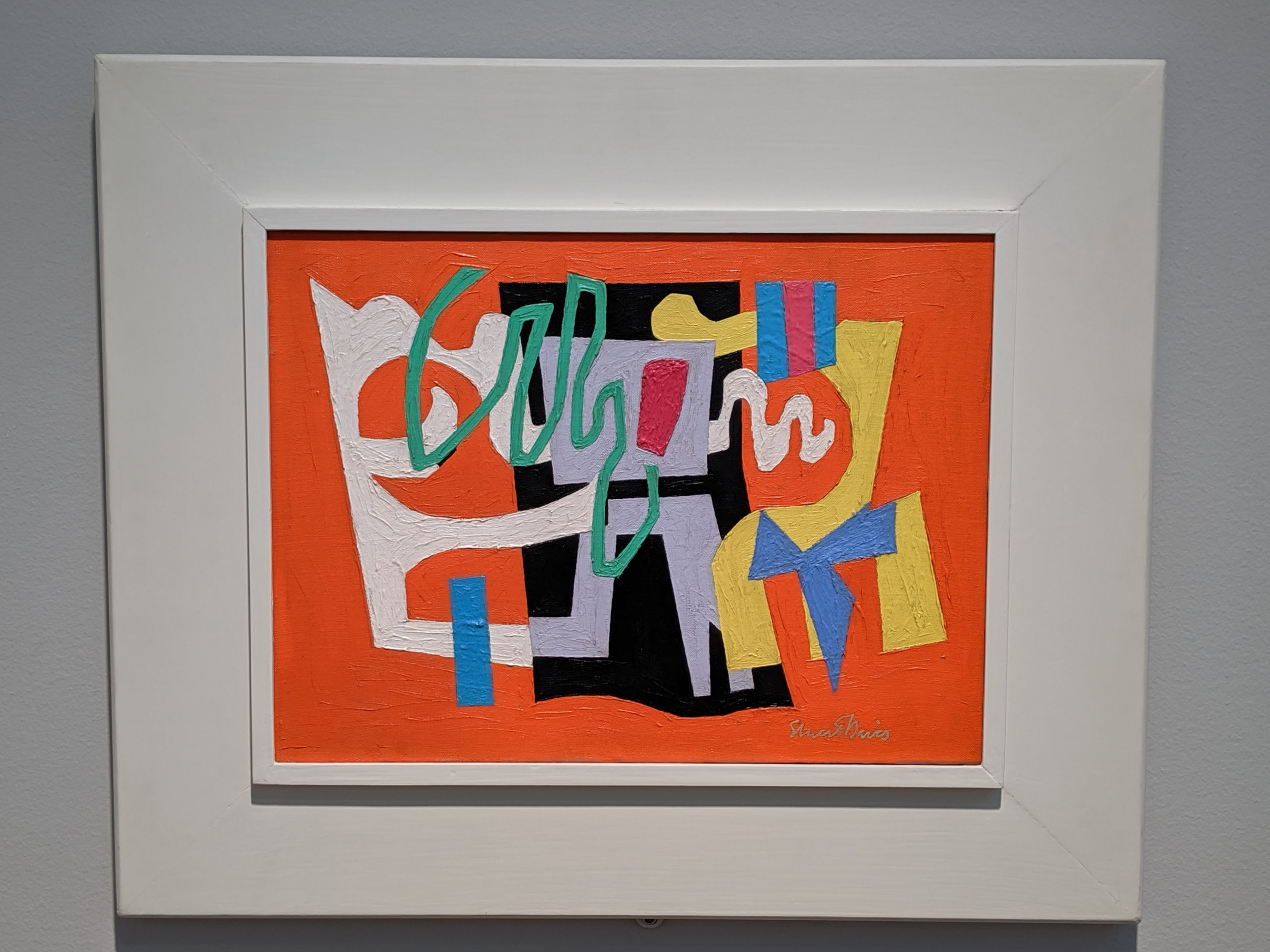
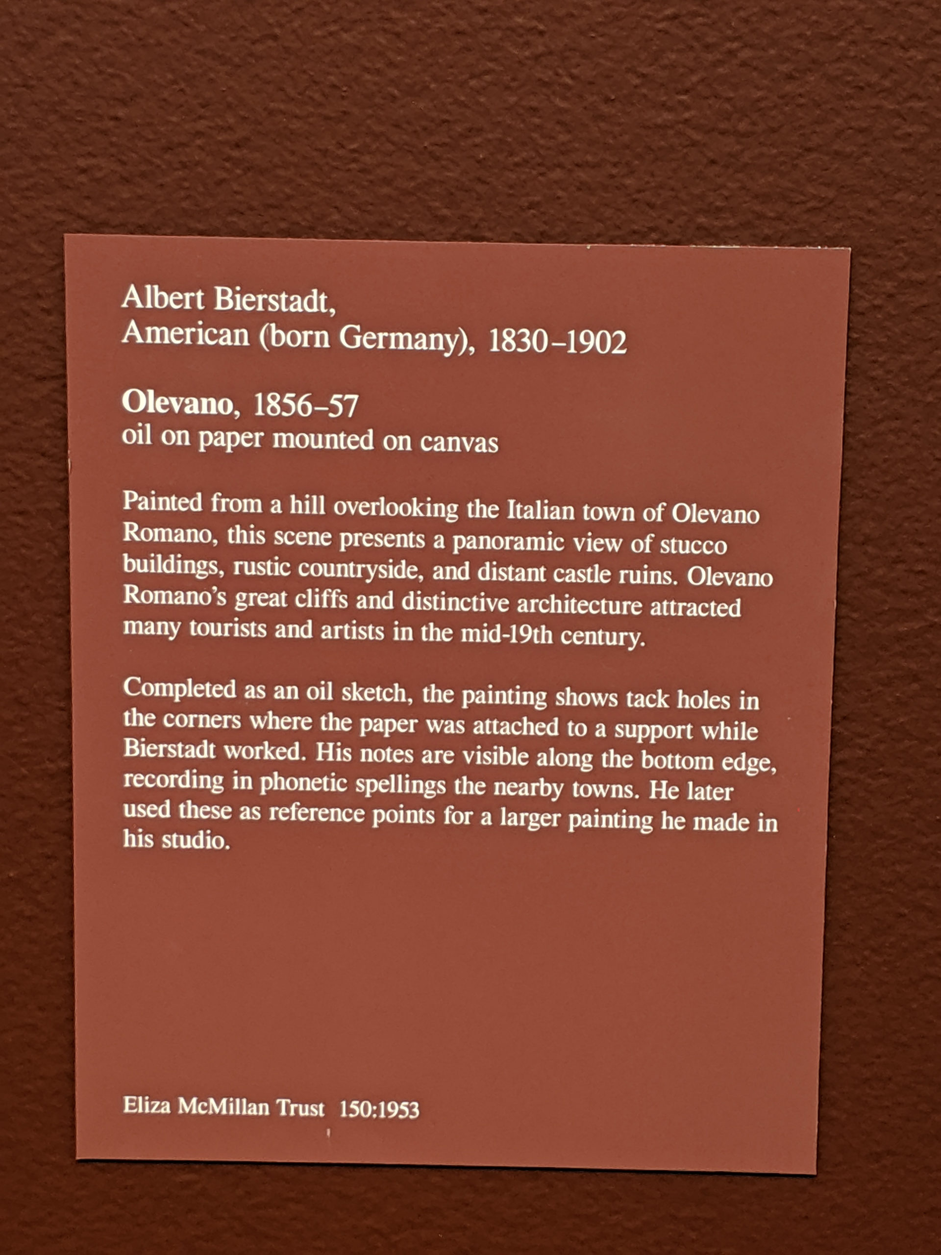
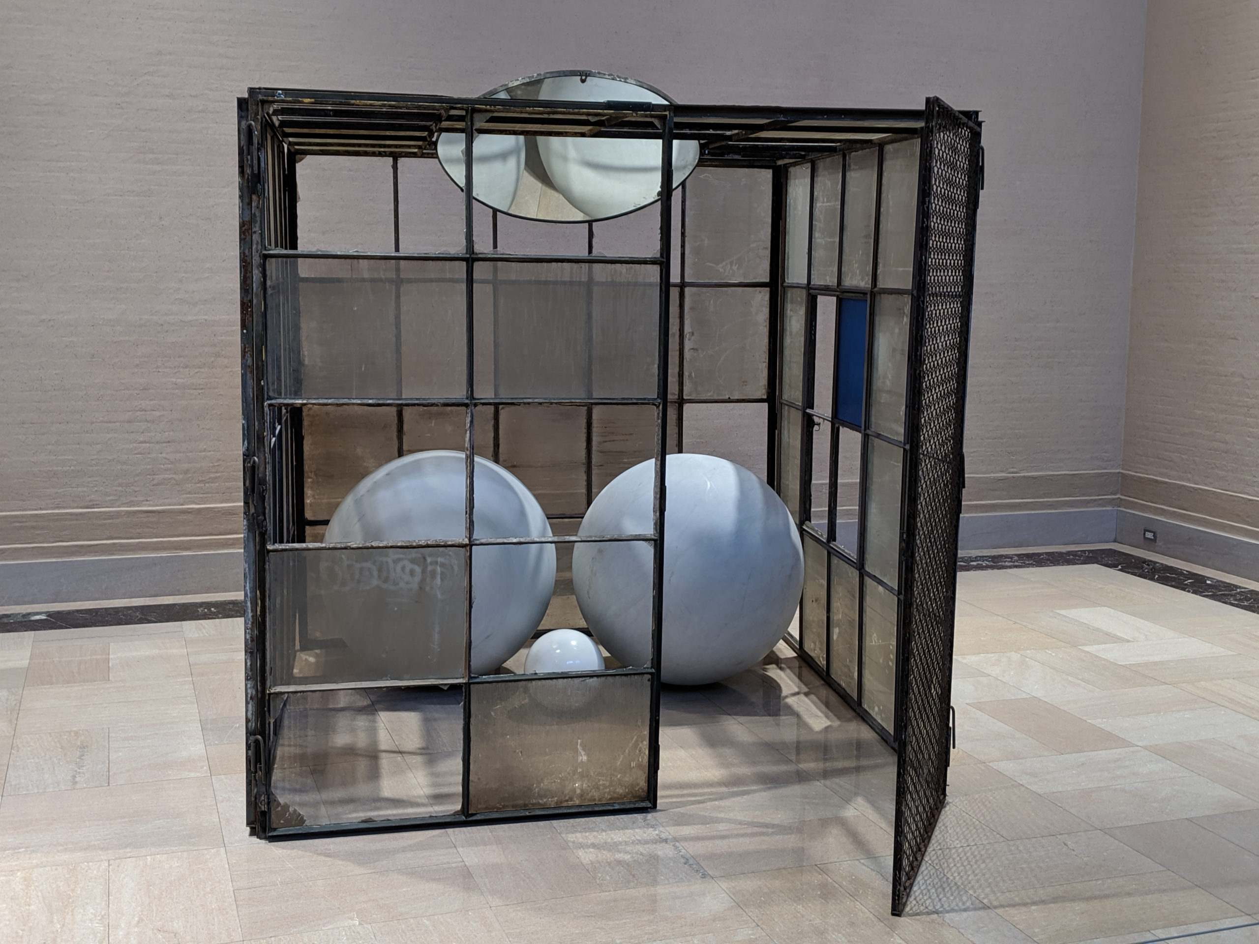
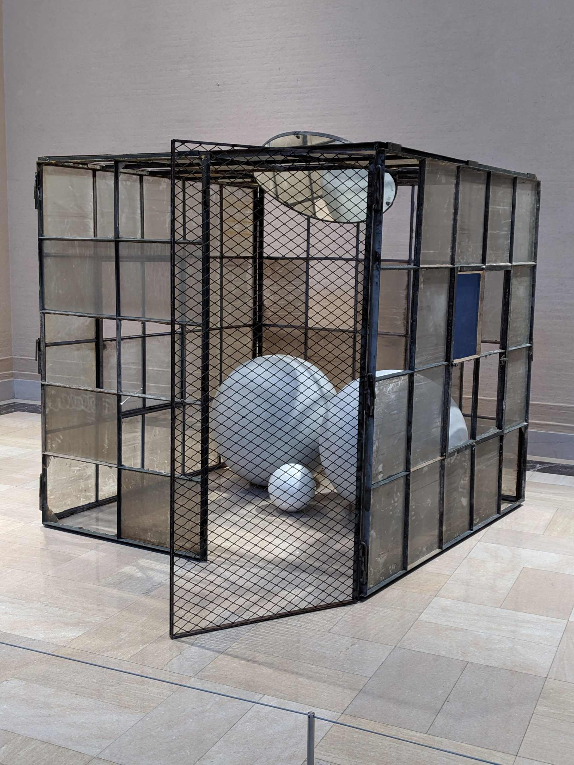
It kind of looks like a clown vomited all over a horror show carnival. I’m not sure I’m down with it. It’s like a cotton candy nightmare. How does that embody feasibility?
Tag: American art
Friday
This fickle, fascinating thing is like an oil slick on water, or drops of paint in a layer of thick cream. It’s a different technique than I’ve seen used before or since, and I kind of feel like it was an experiment gone a bit awry – but that’s why I adore it.
Thursday
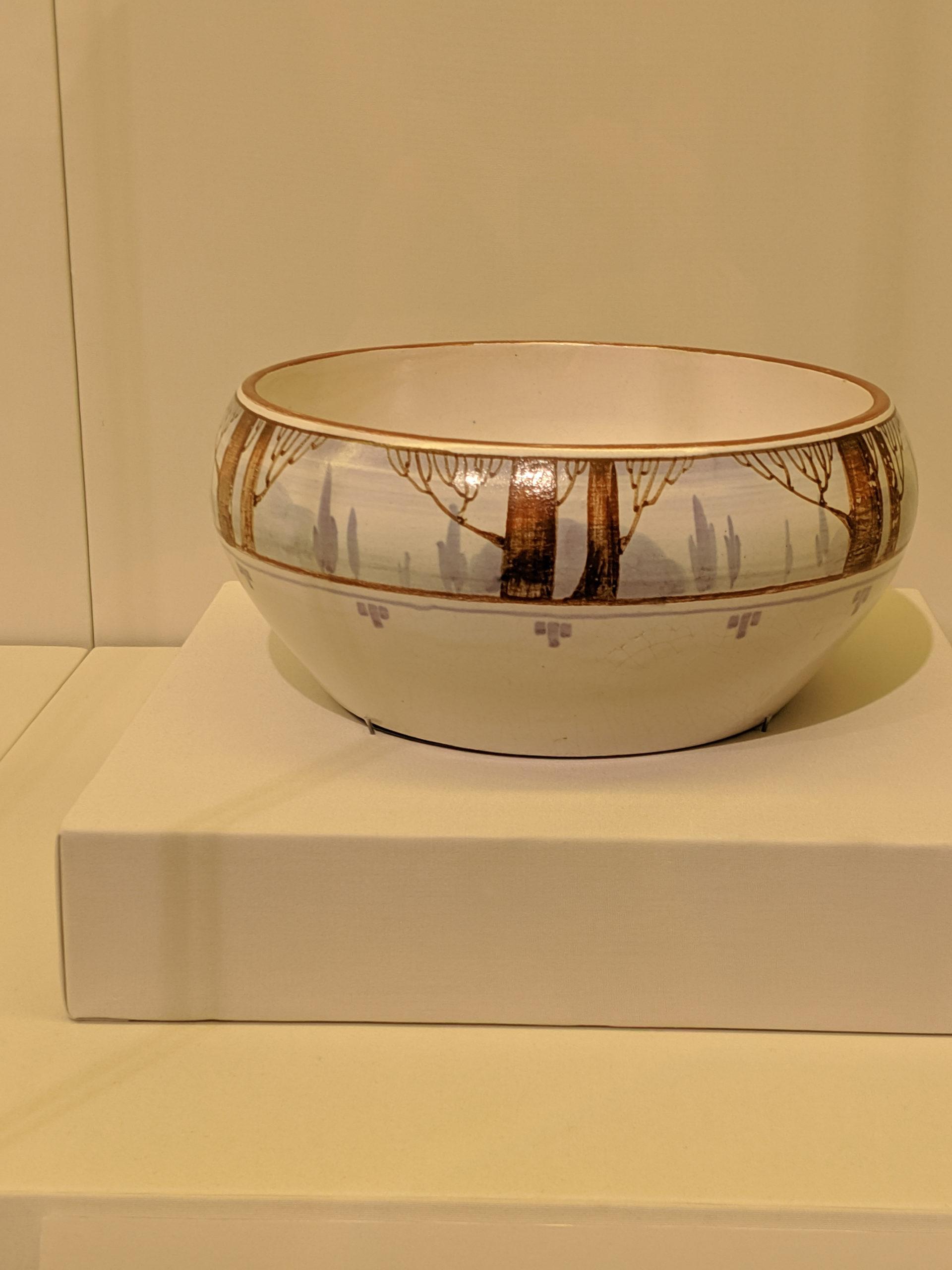
*points* And that, boys and girls, is minimalist pre-deco in the form of a bowl.
Wednesday
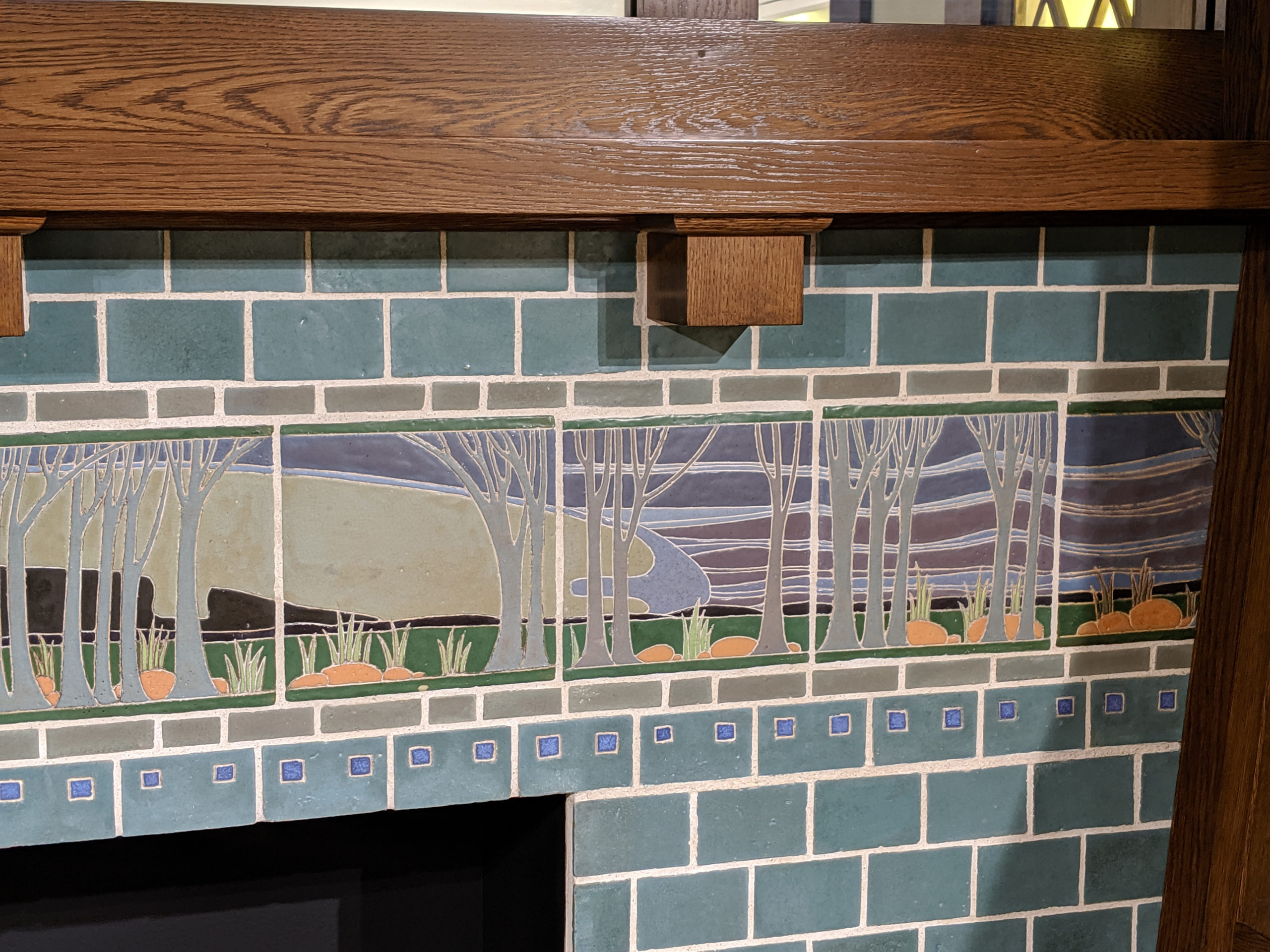
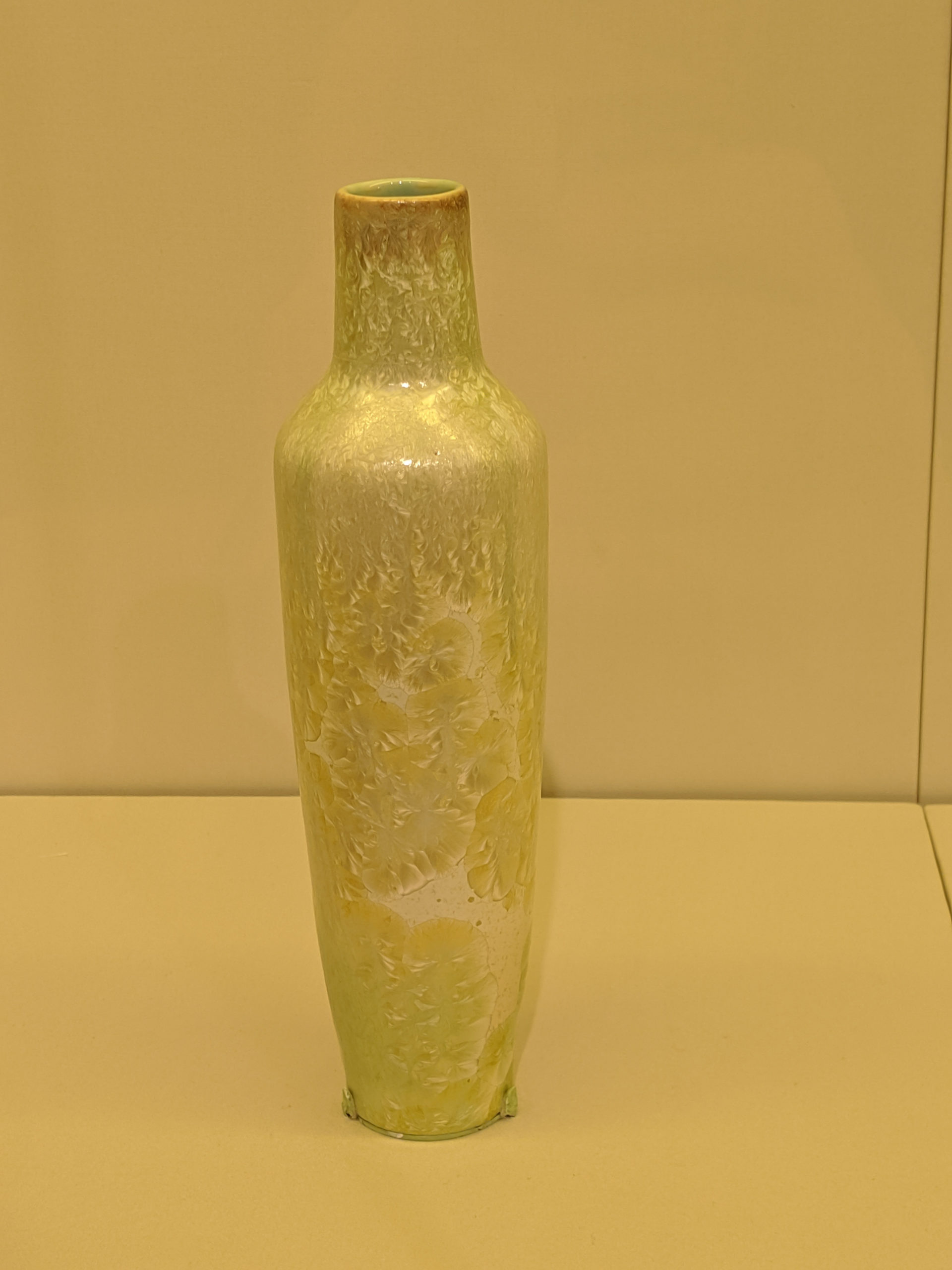
I have such love for the little collection of University City pottery that SLAM has, and there is no finer showcase for the collective talents of the group than this. I mean, look at it: it is breathtakingly simple and elegant, but deliciously modern in a way that was groundbreaking for the early 20th century. The color palette is subdued but makes you feel content with it, and it’s just hella lovely. 10/10, would absolutely visit again and again and again.
Tuesday
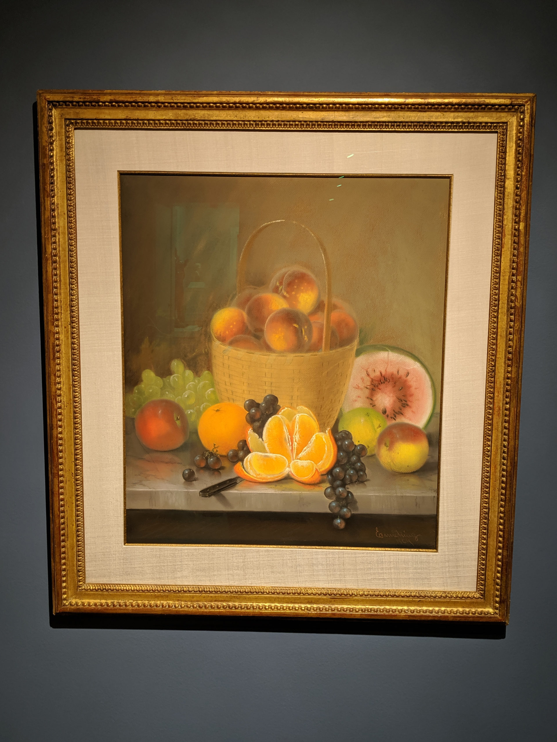
I love this. You can get up close (within reason) and see the pastel’s details, the chalk-like smears and the delicate smudging. It’s actually a very transformative piece to look at.
Tuesday
24 December
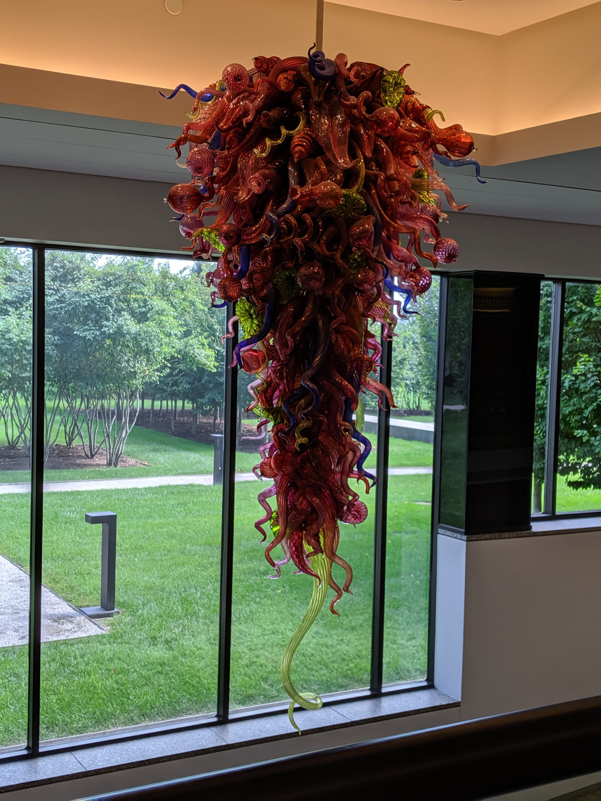
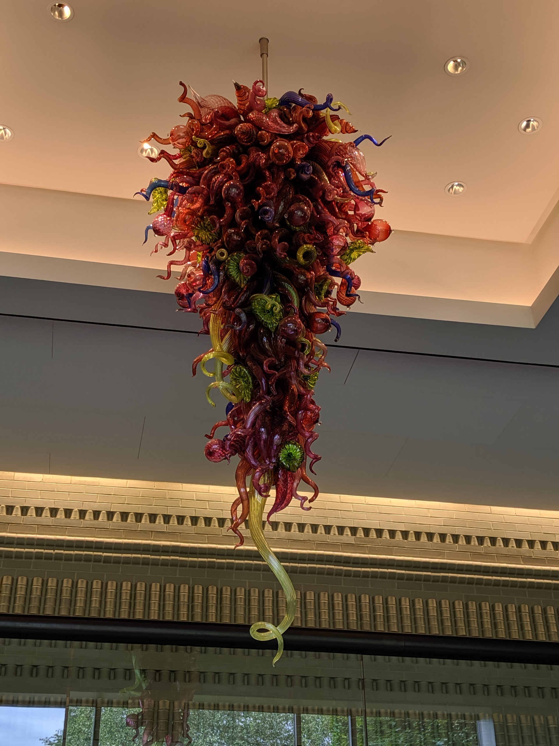
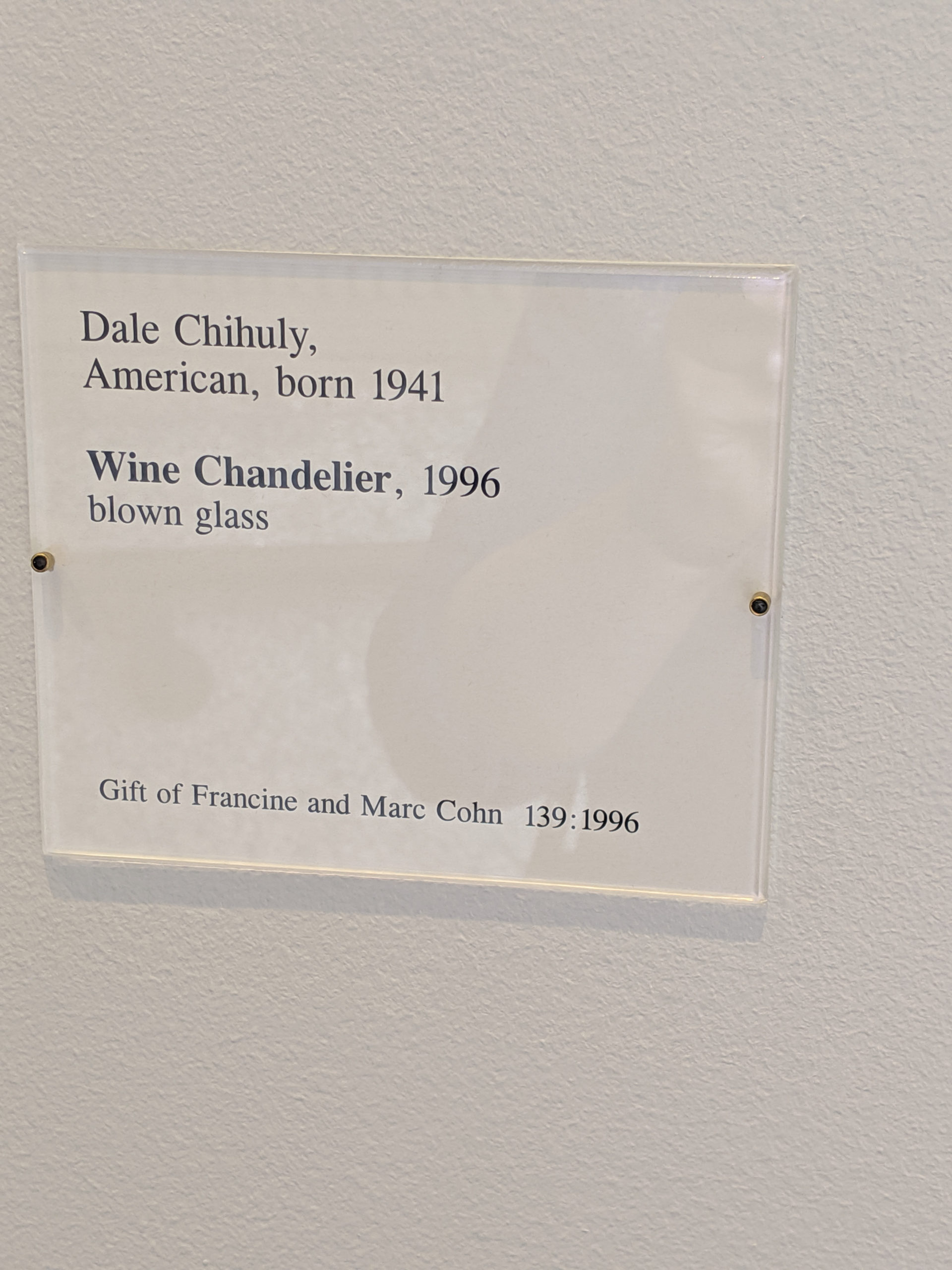
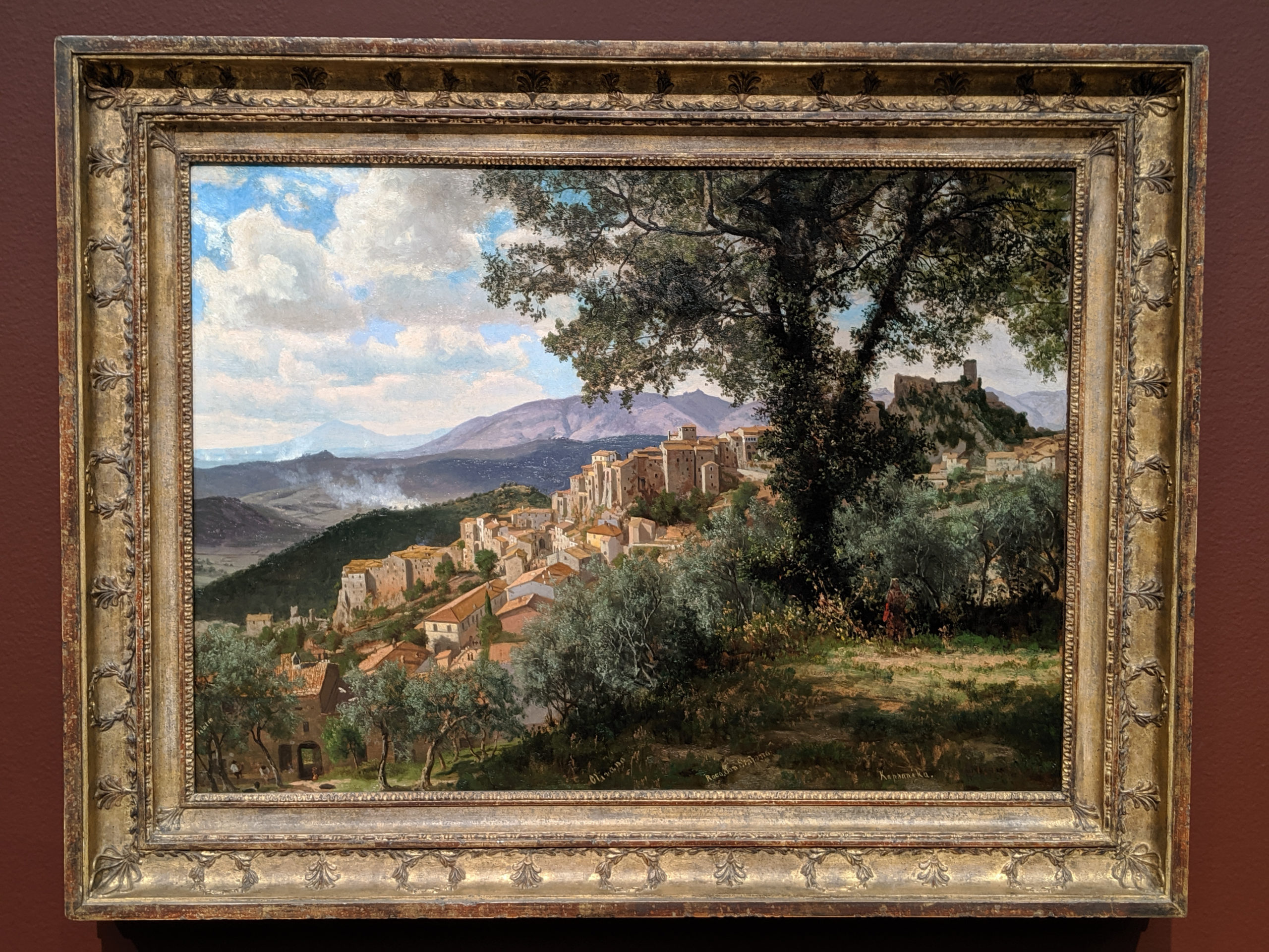
I remember when this used to hang right outside the entryway to Panorama, the Museum’s restaurant, back in the day. You’d have to go beneath the chandelier to go up to Panorama from the bottom floor, and it was like being bathed in broken, bright light from heaven. The lighting is different now, but it’s still so lovely if you can get just the right day – the light just sings.
Monday

(We had some issues beginning December 16, and lost all content tables between the 16 and the 23, so I’m beginning to repost beginning the 23rd of December.)
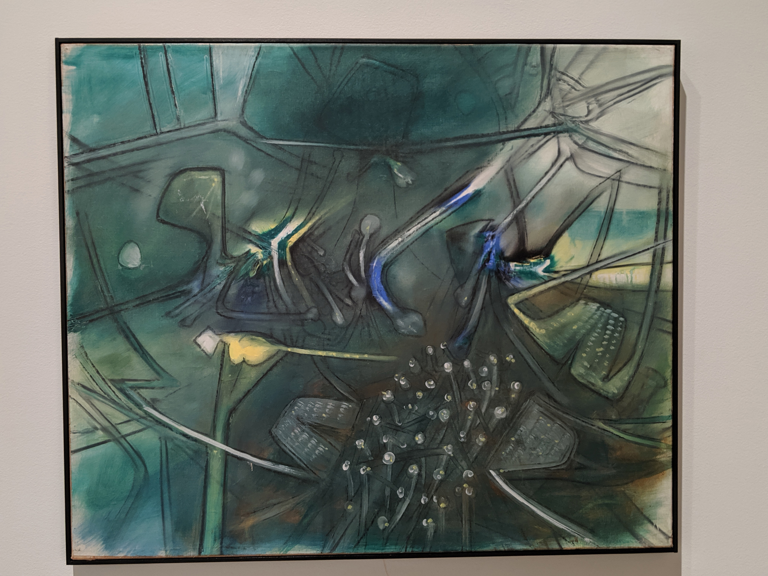
This painting reminds me of science fiction novel covers from the 1970s and early 1980s, or at least the backgrounds thereof. There is something both abstract and comforting about it in a context like that, even though it is slightly disconcerting in other ways.
Sunday
I love that this is so unassuming and totally sitting there, going, “hey, I’m just a piece of art pretending to be a real painting, but I’m legitimately a painting in my own right, but I’m kind of casually just going to be over here in the corner like the redheaded bastard step-kid, mmmkay?”
Thursday
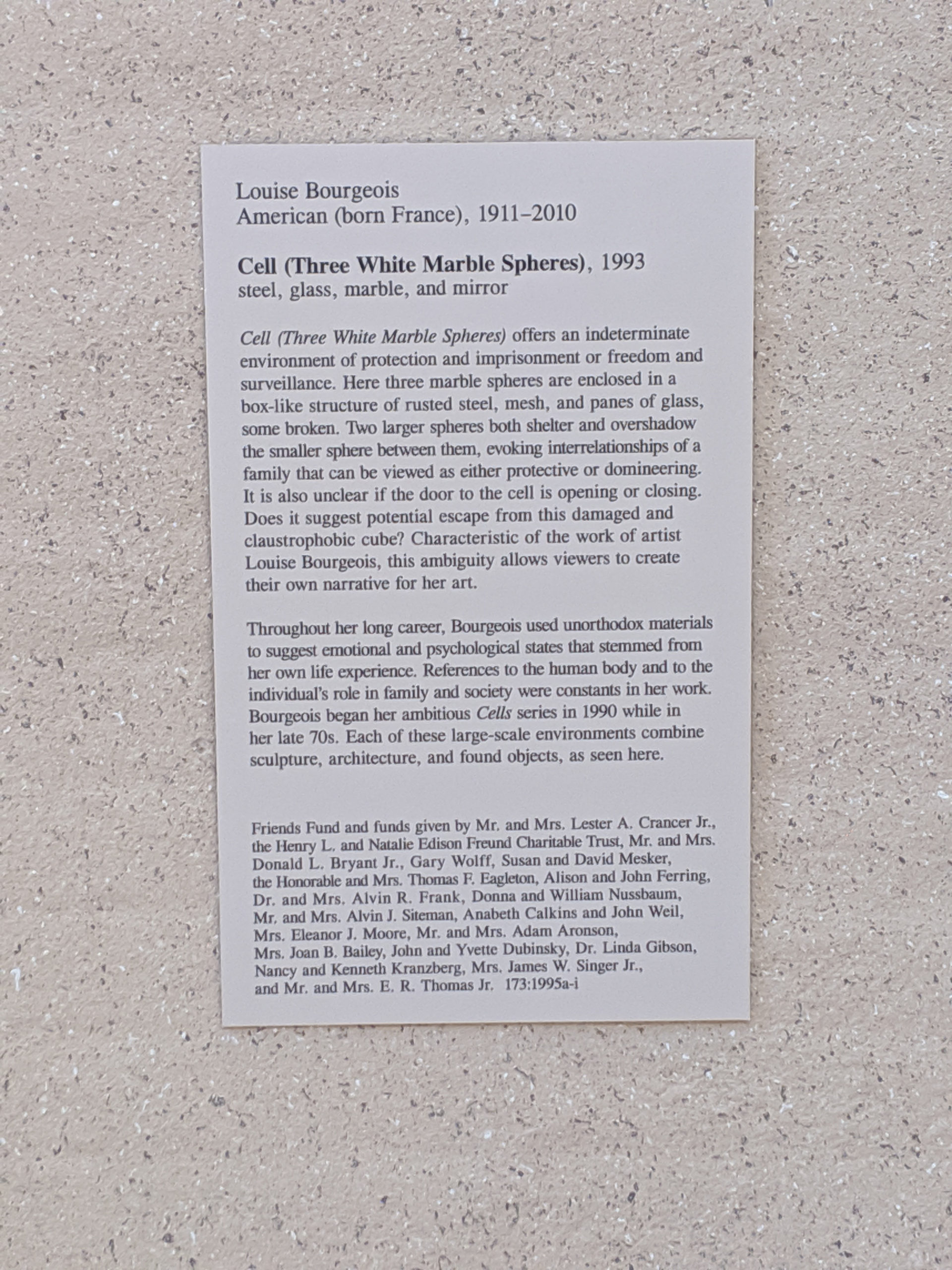
While this is my second favorite work of contemporary sculpture, I never really ascribed to it any of the conventional meanings. In fact, to me, it’s much more of a feeling of abstract notions rather than a direct equation, unlike most people’s interpretations of the work. I feel very calm and centered when I look at it, with a nudge in the direction of intellectual stimulus, rather than, say, wanting to go watch something on television or the like.
Monday
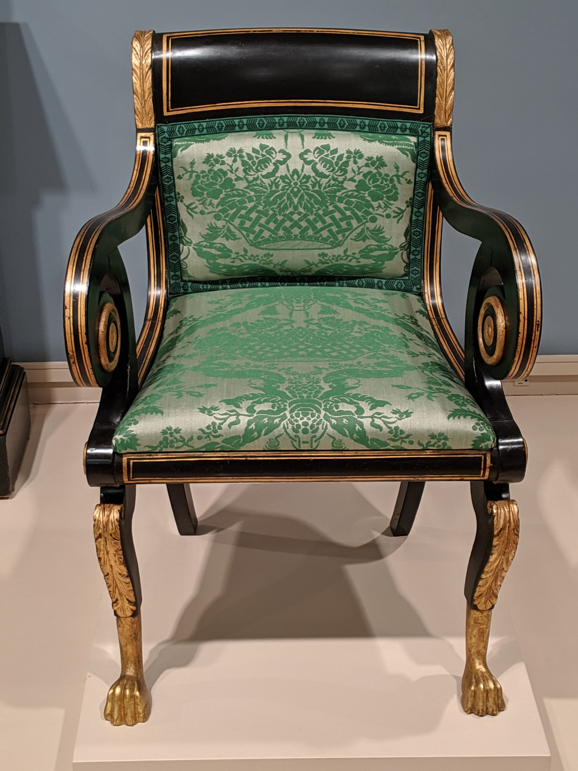
This chair is simply stunning. Though the lines are simple and swooping, they are meant to draw the eye and hold it. The contrast of the gilded coloring against the darkened wood is meant to direct your eyes inward to the exquisite upholstery. And, let’s face it: that cushioning is freaking fabulous.