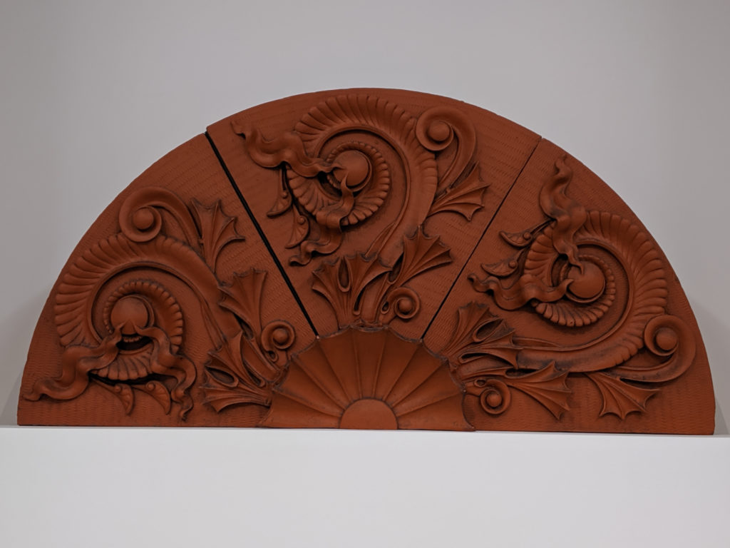
Holy hell on wheels with a side of cheese sauce, y’all, architectural motifs are my bread, butter, and jam. This lunette is a particularly gorgeous example of the form; there’s an element of high drama and almost painful snobbery that gives it an elevated status amongst its peers. Even in un-treated terra cotta, it’s absolutely beautiful. Love it.
Tag: American art
Friday
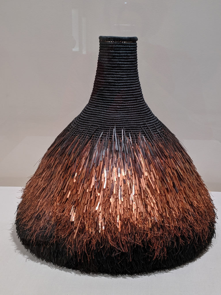
I must be a complete weirdo because this is reminiscent of a bird; the shape, the strata, the overall… it’s very birdlike. I enjoy the variegation of the color and the texture and mixed media weaving throughout the piece. It’s actually much larger in scale than it looks in the photo, and up close is much more fascinating. I adore everything about this.
Thursday


I’m constantly amazed by the juxtaposition of complexity and simplicity in this piece. On the one hand, the lines are achingly simple – and yet they are unerringly complex in design and execution.
Tuesday


This thing is weird as all hell and looks like a sea anemone gone wrong. Fight me.
Monday
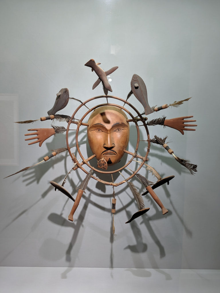
This is one of the single most spiritual things I’ve ever seen. It tells a complete story without speaking a single word. You don’t have to speak the language or even understand any one part of it to understand the whole. It’s incredible.
Sunday
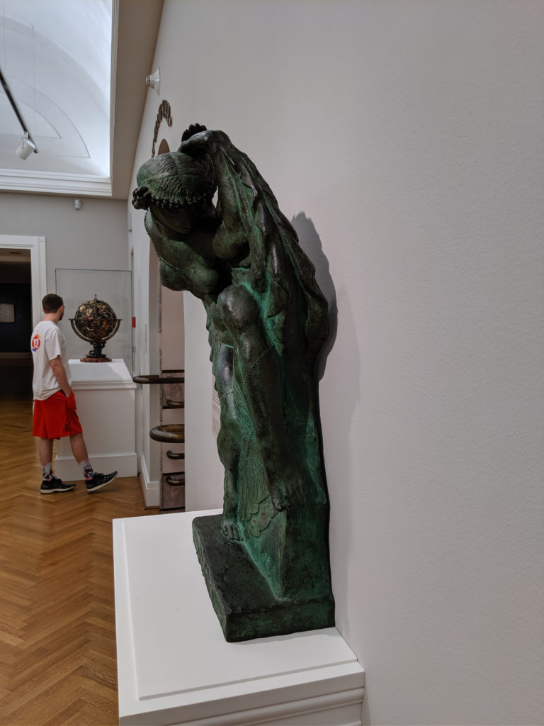
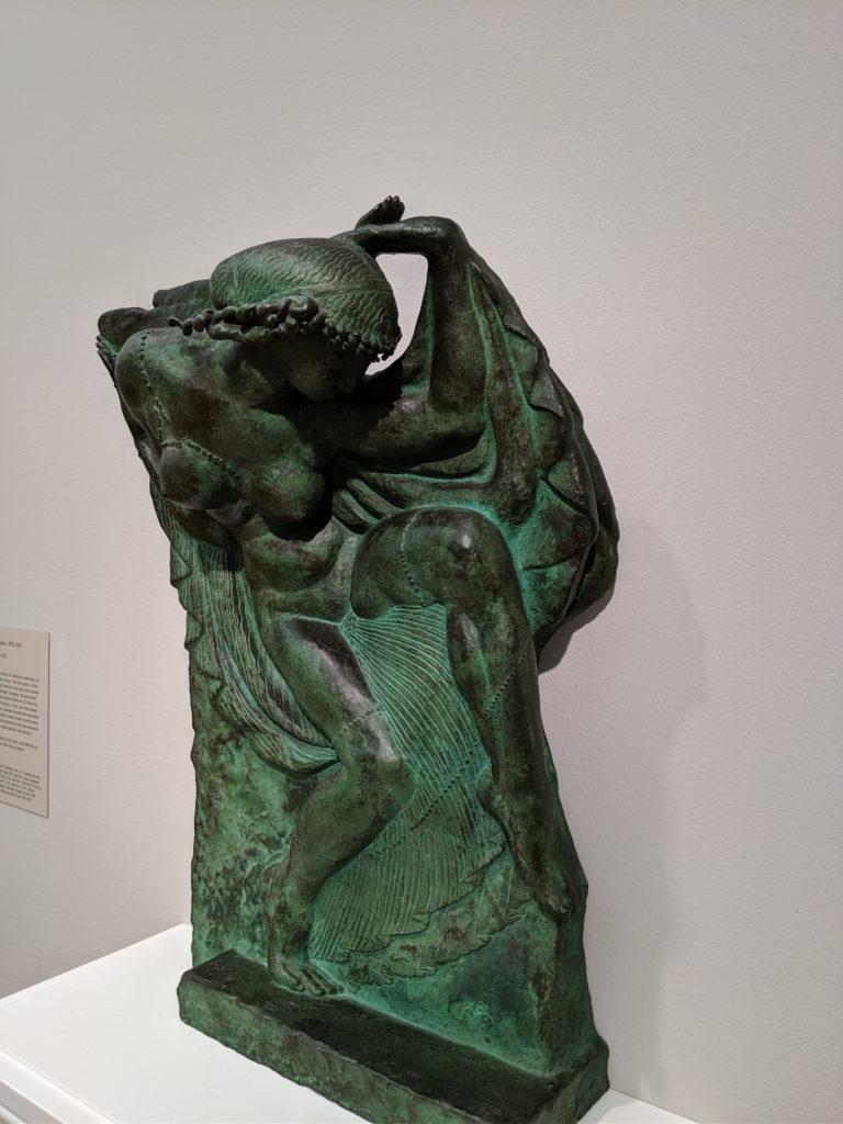
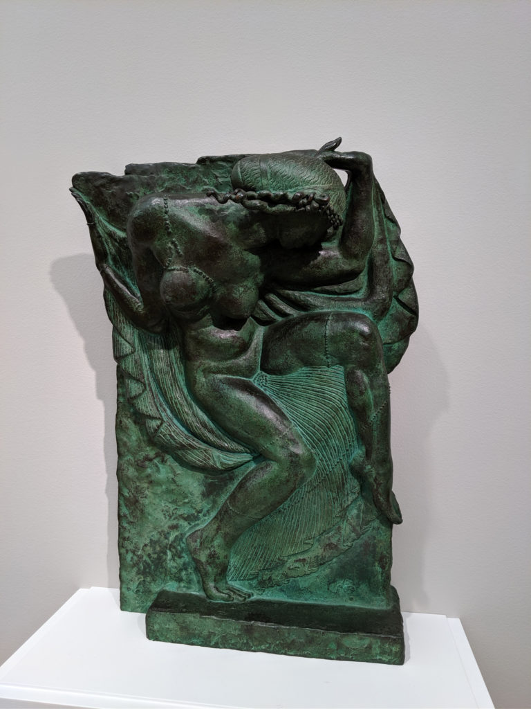
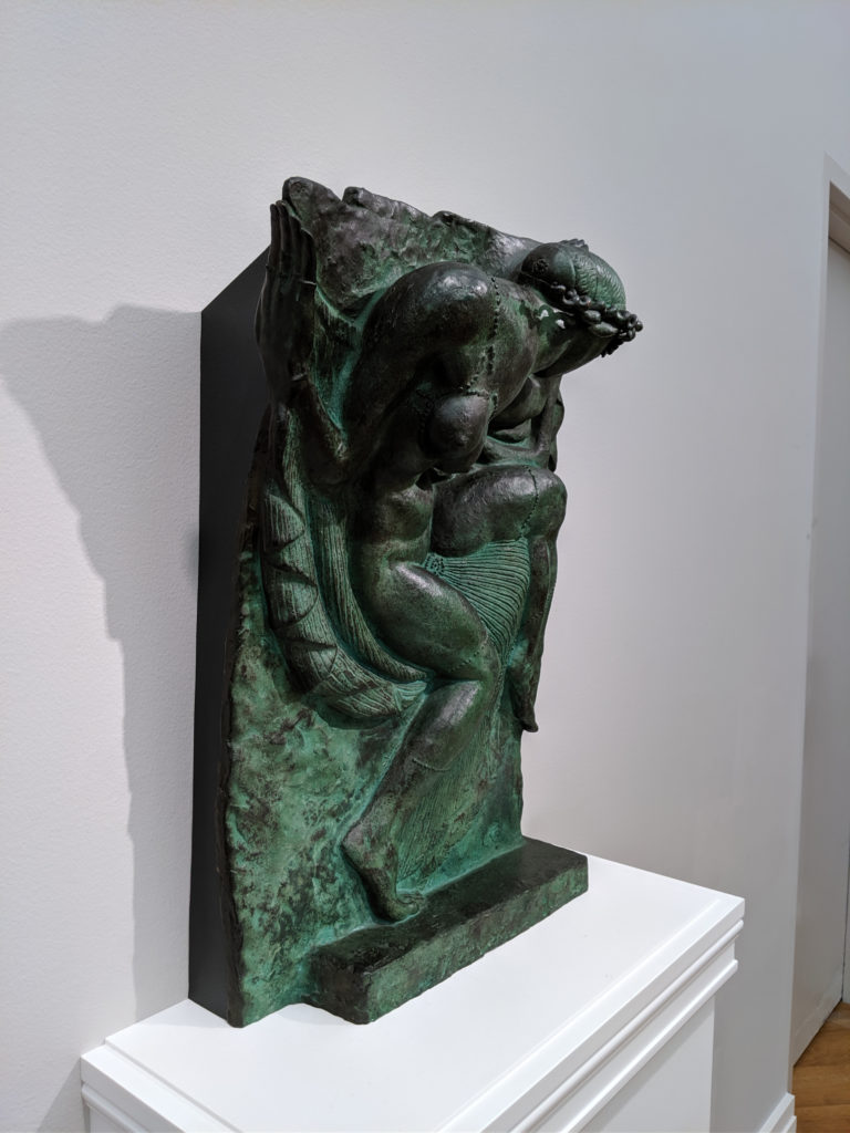
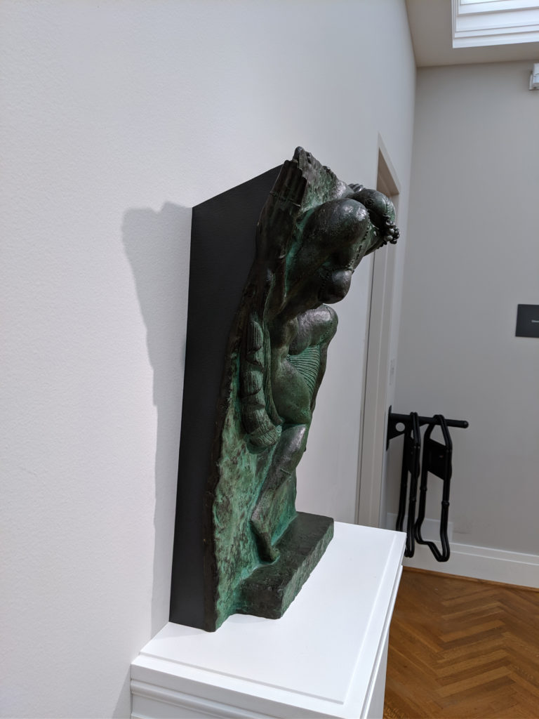
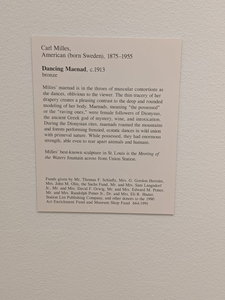
This casting is actually fascinating in person and doesn’t photograph well at all. It makes me sad because it’s so beautiful up close. The detailing and patina is exquisite!
Saturday
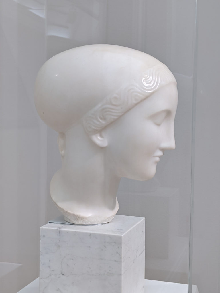
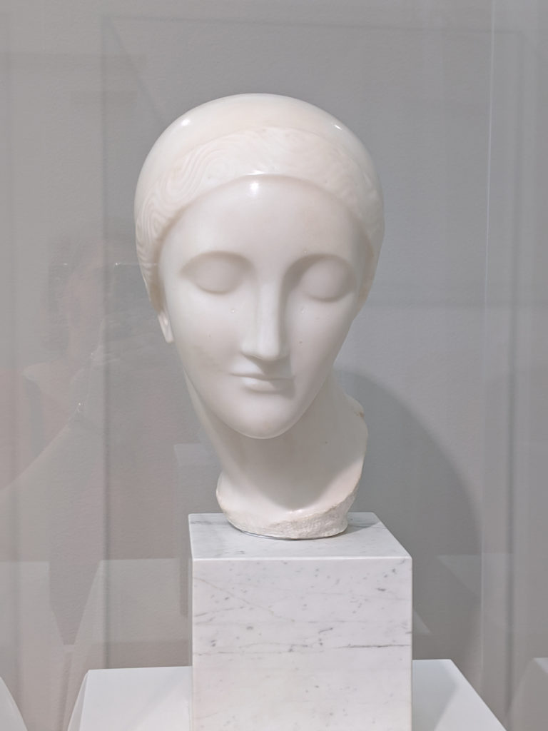

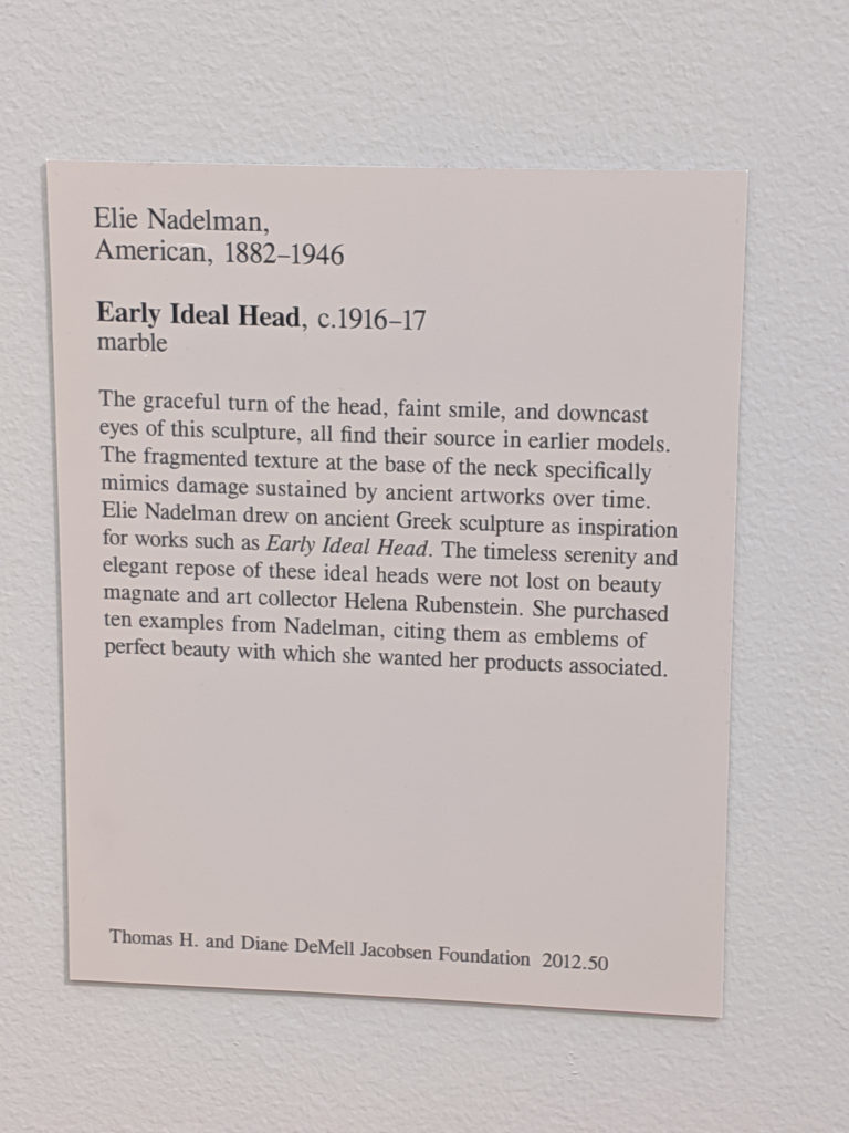
This is another one of those problematic American sculptures that smacks of institutional racism but at the same time is breathtakingly beautiful for what it is and the sheer bloody talent that went into the piece. It isn’t ideal, nor is it idealized except in the artist’s eyes, and it should be said as such. In fact, the features are over-exaggerated in a way that even the ancients would likely have cringed at and thrown away; instead, it is an approximation of an approximation and rather more like an idealized caricature of a female form than any idealization of a modernization. It even has a bit of the post-impressionism expressionism or slightly pre-Art Deco about it without really managing to be any of those things.
Friday
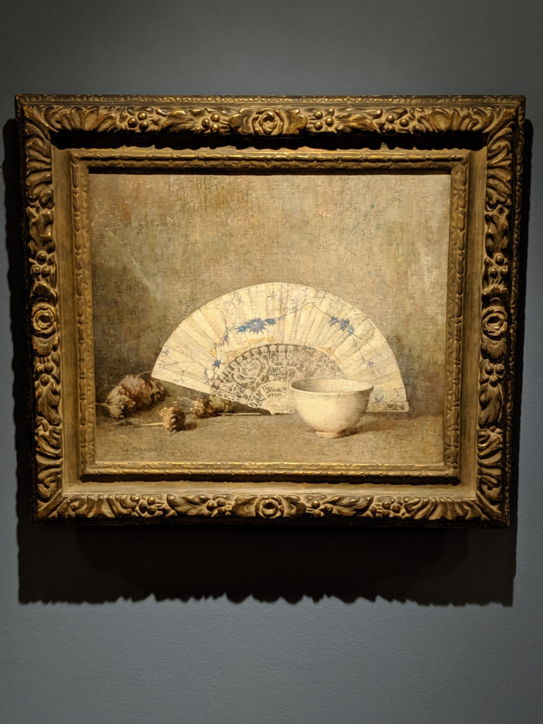
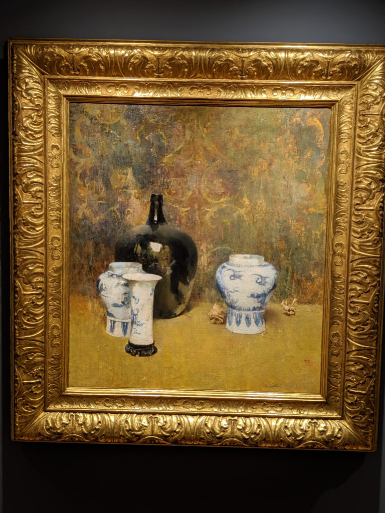
In comparison to yesterday’s still life by the same artist, the color palette is similar but different enough to warrant a mention, as it changes the diffusion of the light and the overall effect of the blurred dreaminess of the edges. Also the overall composition grouping is similar, but just different enough to tweak your senses and make you go, “hmm”. Of the two, I actually prefer this one because the background is simpler and less cluttered and hodge-podge Victoriana feeling.
Thursday
Everything about this painting is fuzzy and indistinct even where there should be a finite edge. I like that blurring of reality and indistinction.
Wednesday


First off, the background is not grey. It’s kind of a watercolored effect of grey, blue and green that comes off as a muted greyish tone in most places. But it definitely isn’t just grey. And I will fight anyone that says it is.
Secondly, it doesn’t matter what the forms are meant to be. What matters is that they are meant to be both positive and negative within the space. They are meant to both work as sharpness and softness against the background, and that is why the background tone is watercolor muted and mixed as it is – to give the distinct definition that the angles and fluid lines need in order to work as they need. And I will fight you if you say otherwise.