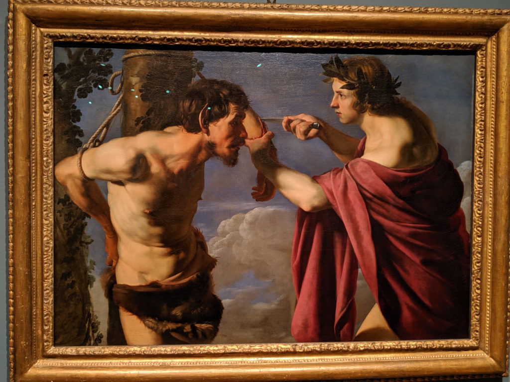
So, quick history of pigments outside of Venice: ultramarine blue was used primarily in painting the Virgin Mary’s robes until the early 17th century, when it kind of branched out into other forms, whilst carnelian and crimson reds had been associated with Christ’s robes and blood until a subtle shift in the Reformation and Counter-reformation created a need to use color differently. Only Venetians really used color differently during this time period, and it was mostly because the amount of fucks they had to give was a big fat zero. Venetians gave zero fucks. Venice was the home of no fucks given at all. This is partially why the sky in this painting isn’t a more vivid and realistic color of blue for the sky, and why Apollo’s robes are a duller shade of red, rather than the godly/kingly shade of crimson.
Tag: baroque
Friday
This, again, is another one of those bridges between Baroque and Rococo that doesn’t quite fit either genre but shares elements of both movements.
Wednesday
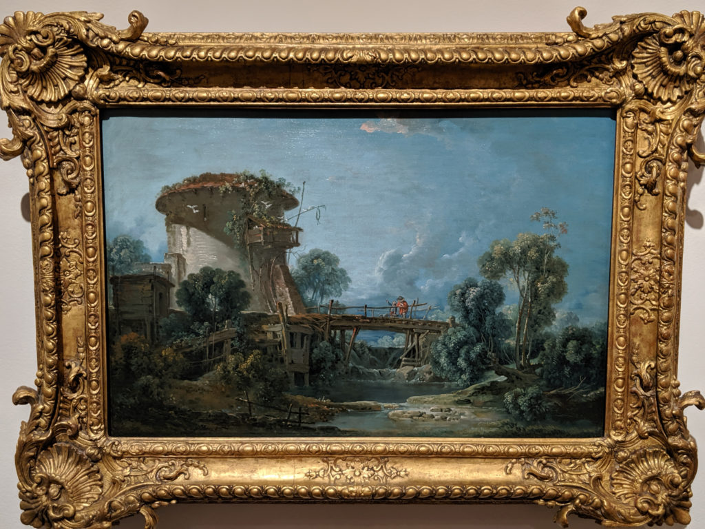
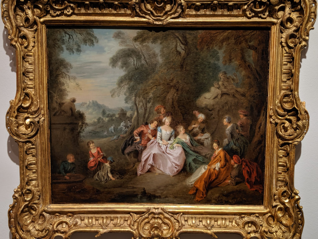
This is kind of your typical bridge point painting for what happened between the Baroque and Rococo – it was landscapes and a sense of uneasy peasant whimsy with just a hint of aristocratic finery that’s out of place.
Thursday
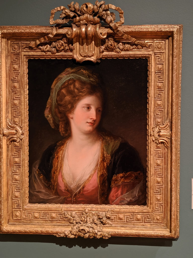
Back in the day, portrait painting was one of a handful of legitimate jobs that women could do that brought prestige. However, they very often were attributed to their male counterparts for obvious reasons (aka, a woman couldn’t paint that well, no formal training, etc.), which makes this portrait special in the SLAM collection. It is correctly attributed, it is well-painted, the brush strokes are minimal and the subject appears almost airbrushed. Welcome to the 18th century equivalent of Photoshop!
Sunday
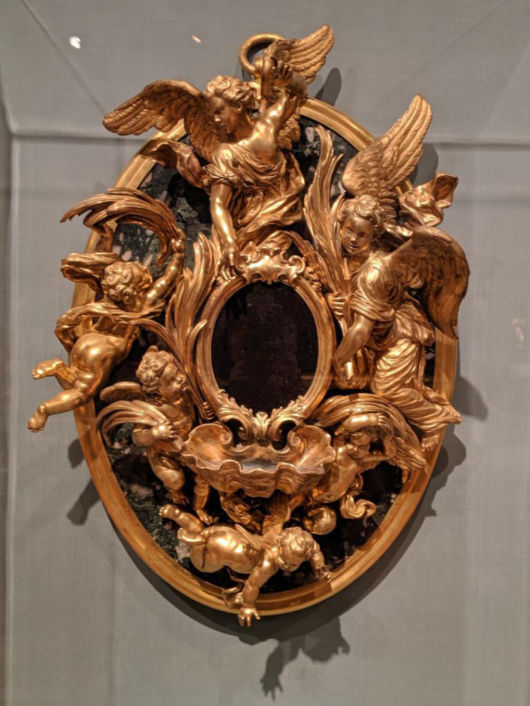
Baroque is about being over the top, but only in the most elegant possible manner. There is no way on earth that you’re going to be playing patty fingers in the holy water with this font, and that’s the point: elegance to the point of misery. Beauty and majesty to the point that you behave yourself or so help you…