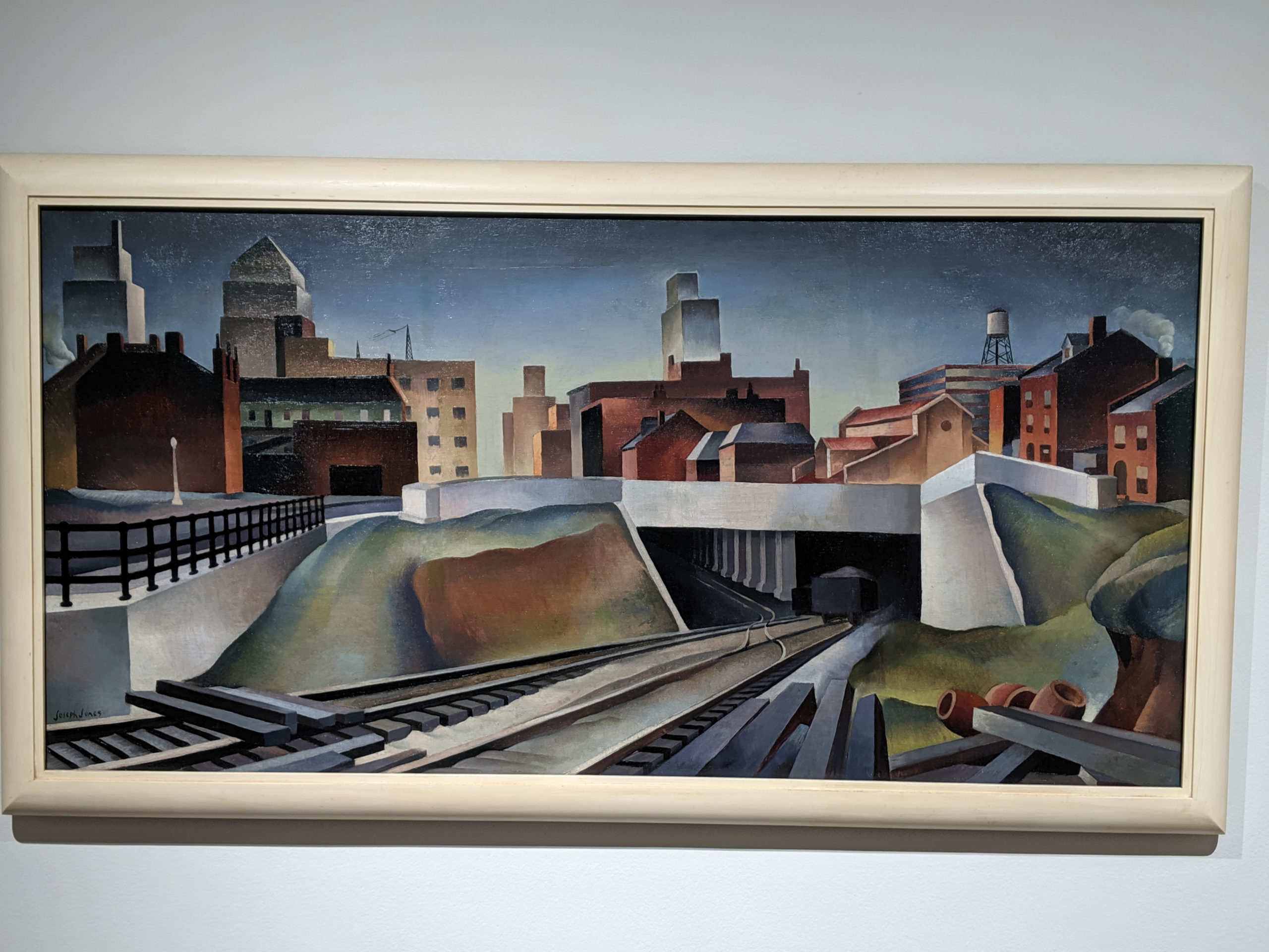
A lot has changed in St. Louis over the years, including urbanization, city blight, gentrification, etc., and that began as early as 1888 in some parts of the city. This painting embraces a kind of optimism about the pre-WWII industrial expansion that was going on in parts of the city and shows it off in bright colors and flashy ways that belies the truth of how the sprawl actually became more of a problem than a solution.
Tag: painting
Tuesday

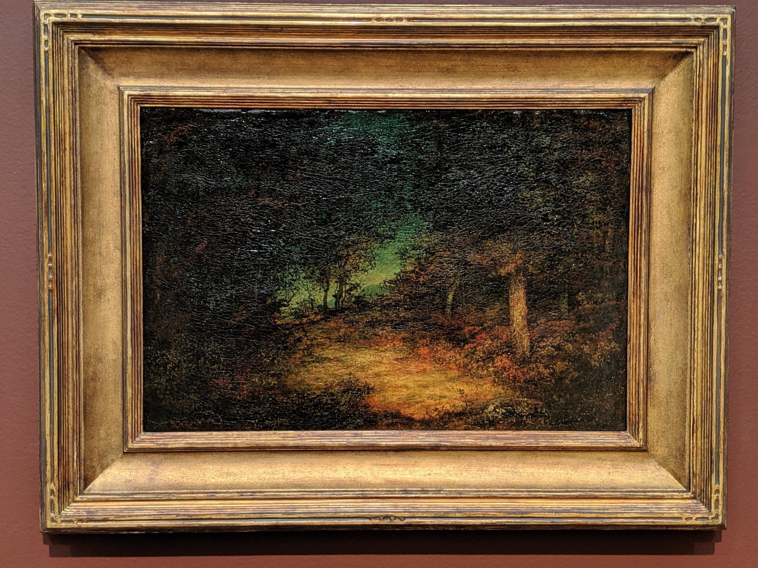
This is kind of that bleak, desolate post-Civil War American landscape that we just kind came to expect from the Reconstruction era. The country was still divided and scarred and people were tired and not at all okay with any of it. The art of the time reflected that dismal quality and while beautiful and serene, many of the landscapes have this depressing quality that you can’t quite quantify.
Monday
This painting is insane. Off the charts. The lighting literally follows you as you move around the room and changes shape and does crazy, creepy things. It’s crazy, creepy, intriguing, and insane.
Sunday
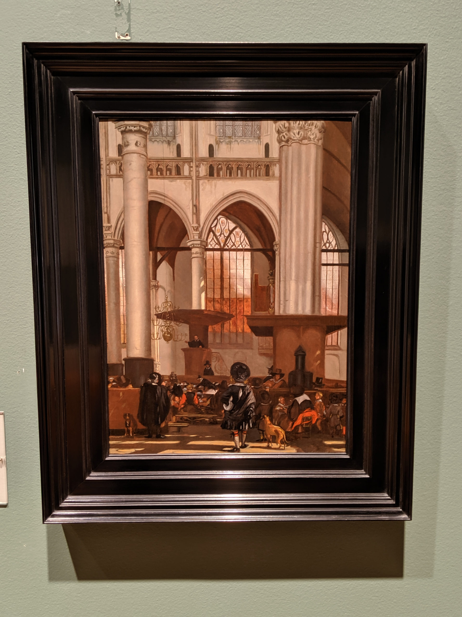
I feel like this is a study of everything I dislike so much in 17th Dutch painting: it’s a monochromatic study in browns of the interior of a church in a hyper-realistic psuedo-photographic style. It’s too much of a muchness. It’s the world duplicated in an exactness that is depressingly real, but in monochrome brown. (And to me, brown is the antithesis of color: it is all colors mixed together, so it isn’t really a color at all, but rather a lack of color.)
Friday
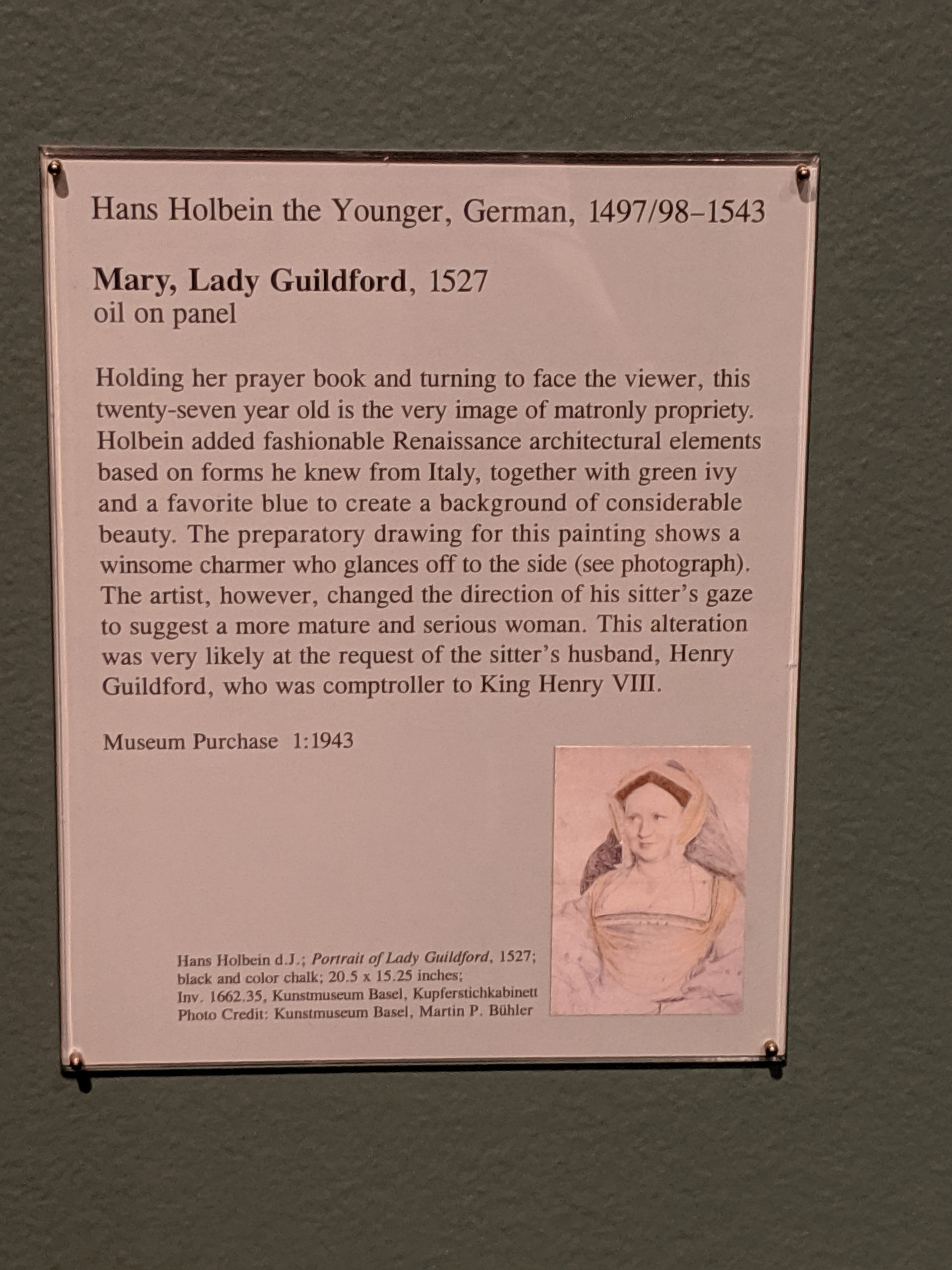
It’s crazy to go into a museum and walk up to artwork and go, “My ancestor made that.” I do that every time I come to this painting. It’s a surreal feeling.
Monday
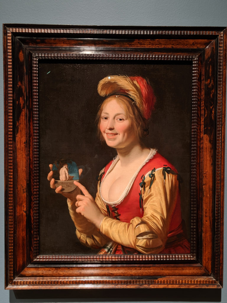
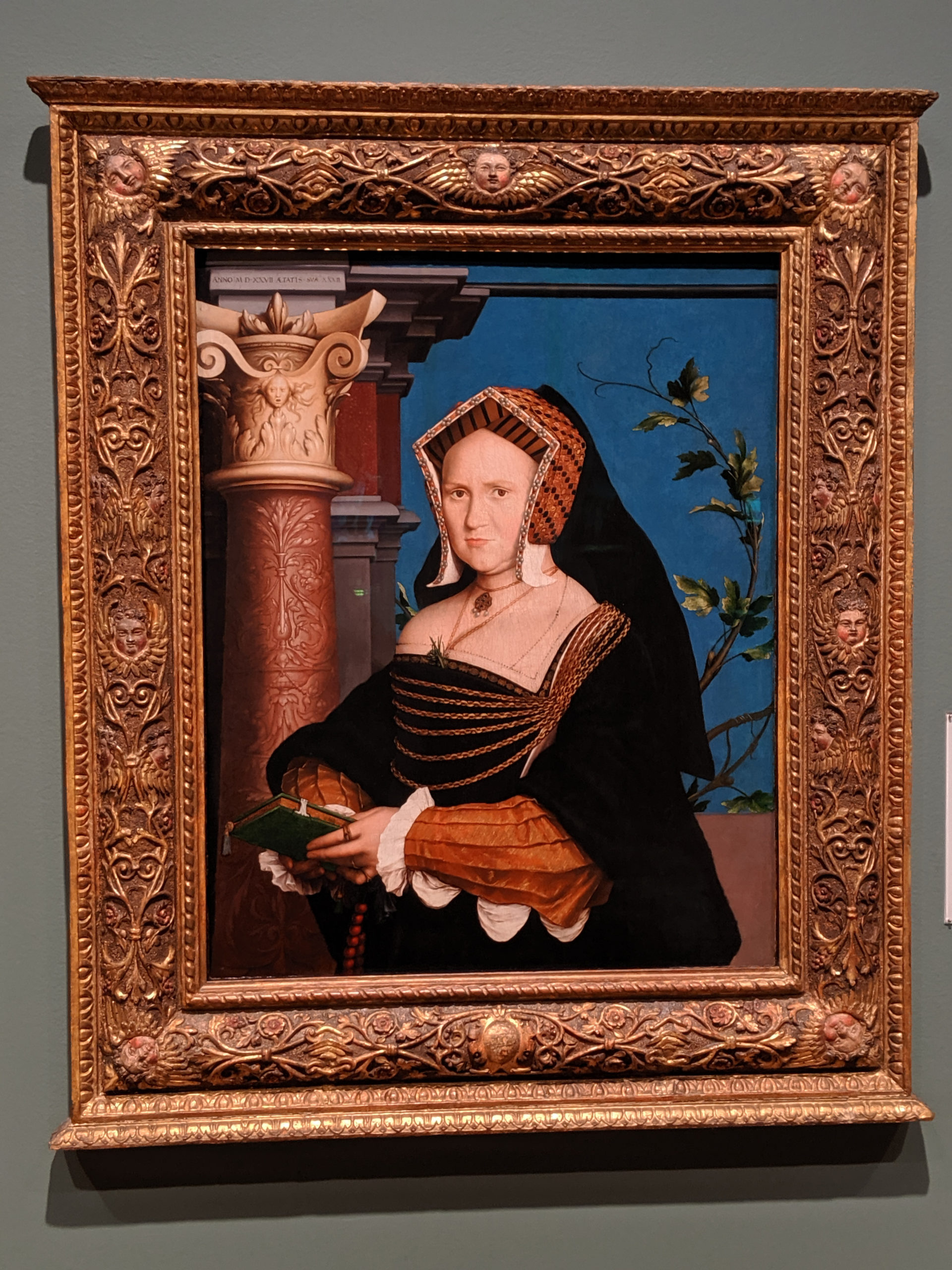
This painting is forever being trotted out in documentaries as an example of the frivolous nature of the beginning of the Rococo school of art. In reality, it’s a big fat middle finger to the Establishment – you want a courtesan? She’s not really that pretty and she smiles too much. You want fashion and frivolity? She’s nice enough dressed, I’ll grant you, but the fabrics aren’t as high quality as you’d expect in a society portrait and it’s missing some elements of crazy status. You want smutty sex and naughtiness? She’s holding what amounts to an erotica novel on the subway today: not much substance, but some outer fluff. It’s all a lot of misdirection and poofy flounce. It isn’t that naughty at all, even for its time!
Sunday
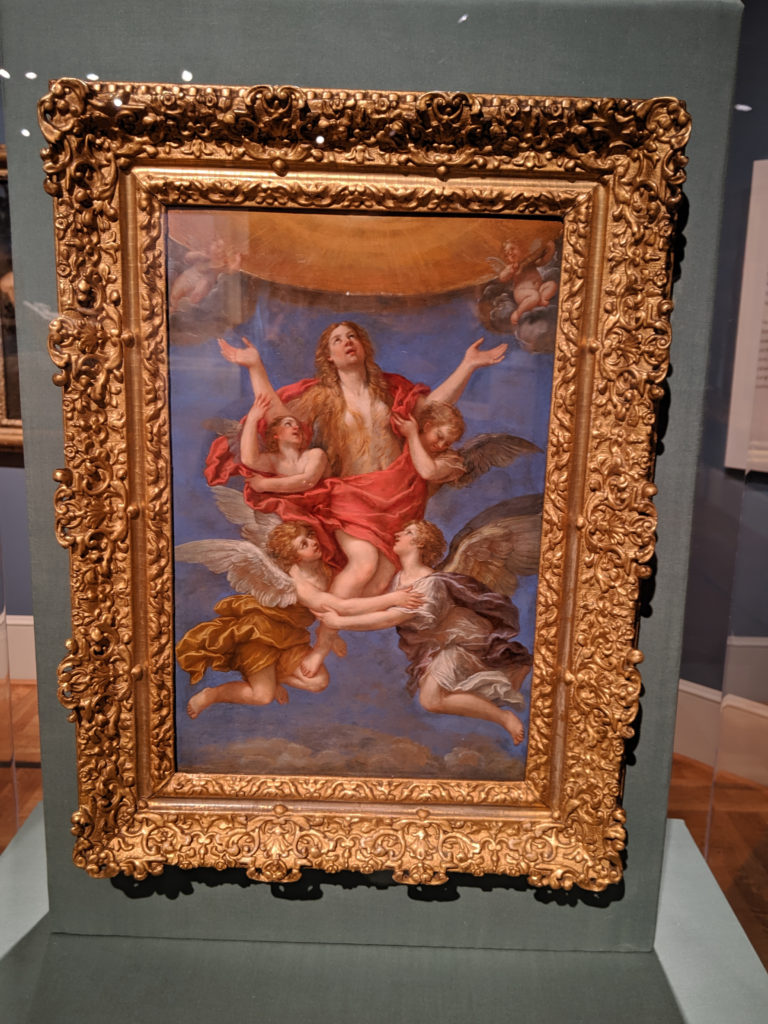
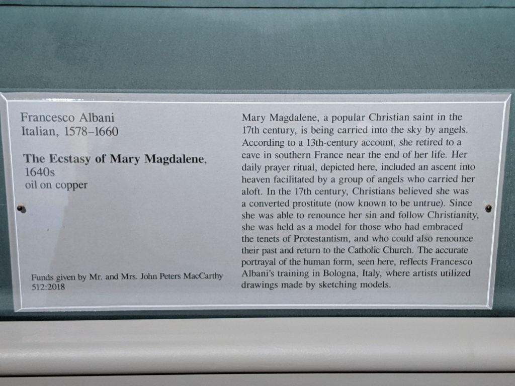
So, hey, it was totally a thing with the religious artists to paint prostitutes and adulteresses with their breasts exposed or partially exposed because that’s apparently how you tell someone is a hooker or sleeping with someone not their husband. Don’t get me started on Christ and the Woman Taken in Adultery, yo. We’ll be here all night. But yes, it is a theme. Apparently, it’s a theme that extends to reformed prostitutes turned saints, as well, because, oh hai Mary Magdalene’s boobs for no particular reason whilst angels get eyefuls adoringly, also for no particular reason. Classy, y’all. Why exactly the reformed prostitute saint is being carried aloft into the sky by angels as if she’s a Boeing jet is anyone’s guess, but we’ll leave that to your imagination and hope that your guess is better than mine.
Saturday
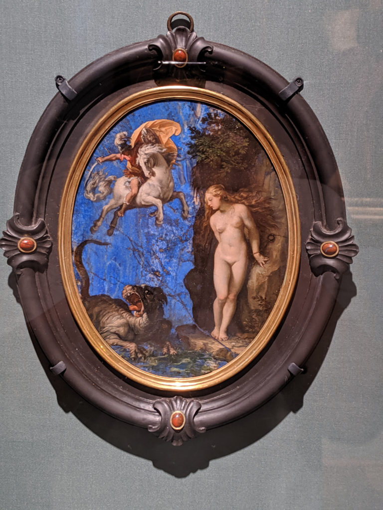

The most interesting thing about this, compositionally speaking, is that the grain of the lapis is used structurally as part of the painting as much as any of the actual painted lines. I like the balls it takes to go, “Hey, nature? Suck it.”
Friday
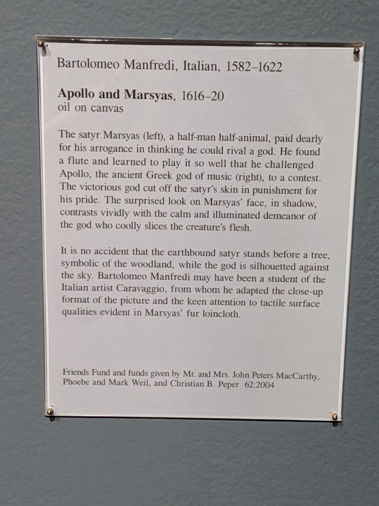
So, quick history of pigments outside of Venice: ultramarine blue was used primarily in painting the Virgin Mary’s robes until the early 17th century, when it kind of branched out into other forms, whilst carnelian and crimson reds had been associated with Christ’s robes and blood until a subtle shift in the Reformation and Counter-reformation created a need to use color differently. Only Venetians really used color differently during this time period, and it was mostly because the amount of fucks they had to give was a big fat zero. Venetians gave zero fucks. Venice was the home of no fucks given at all. This is partially why the sky in this painting isn’t a more vivid and realistic color of blue for the sky, and why Apollo’s robes are a duller shade of red, rather than the godly/kingly shade of crimson.
Wednesday
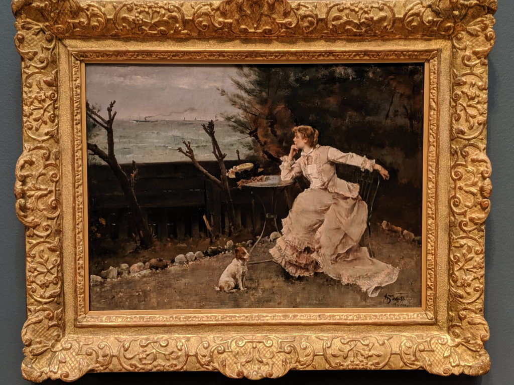
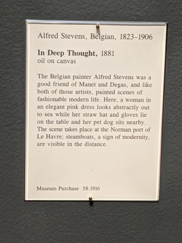
I like this because the composition is very simple and modern in its simplicity while mocking the idleness of the upper middle class and upper class. I mean, what do you do during the day? Sit around and wait for something to happen. Work? Piffle. We’ll work when we’re dead, darling. Work is for the poor.